Information architecture for wîse up
Bringing structure to digital learning
With wîse up, I created a clear structure and navigation system, making it easy for users to explore content and for the team to manage it as the platform grows.
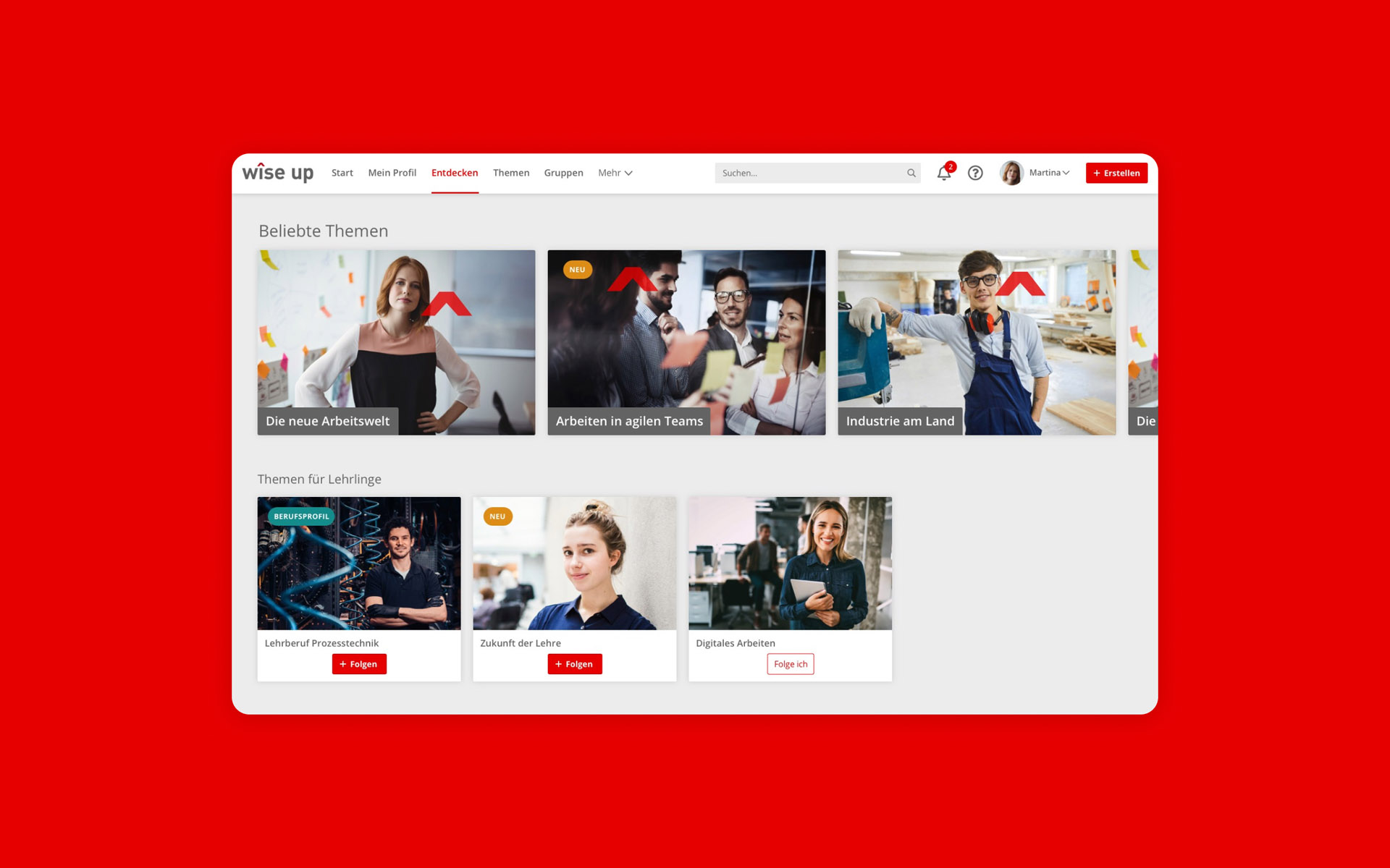
Facts
Client
Bildungsplattform der Wirtschaftskammer Österreich GmbH
Team
Birgit Hartl
Daniel Weingartshofer
Felix Kittler
Julia Huber
Klemens Riegler-Picker
René Mähr
Emanuel Jochum
My role
Information architecture
Navigation concept
Knowledge & content strategy
Period
2021–2022
Sector
Education, digital learning
Platform
EdCast LXP
Challenge
wîse up, the learning platform by the Austrian Chamber of Commerce (WKO), is here to support professionals across all industries in their professional training. Built on EdCast LXP, the technical foundation was there, but the experience wasn’t yet shaped. There was no existing structure, no clear navigation, and no consistent logic to manage content over time.
The challenge was to define the platform’s information architecture from the ground up, create a navigation system that helps people find learning quickly, and provide a content strategy that supports future growth. The solution needed to serve both users and internal teams, in a way that’s scalable, maintainable, and easy to understand.
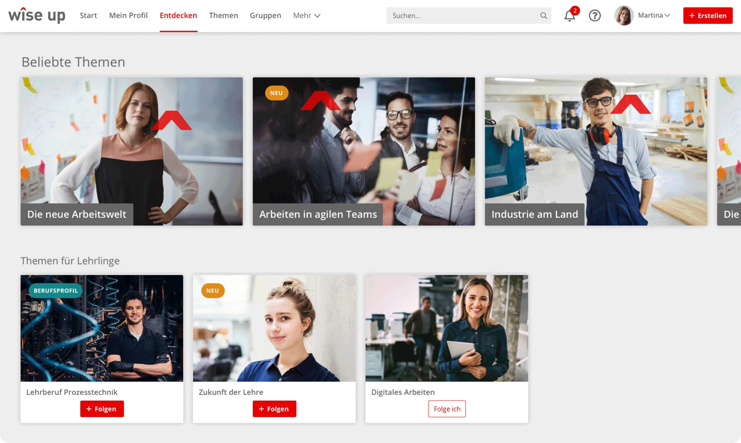
In the “Discover” area of the platform, users explore featured content, curated paths, and recommended topics through cards and carousels.
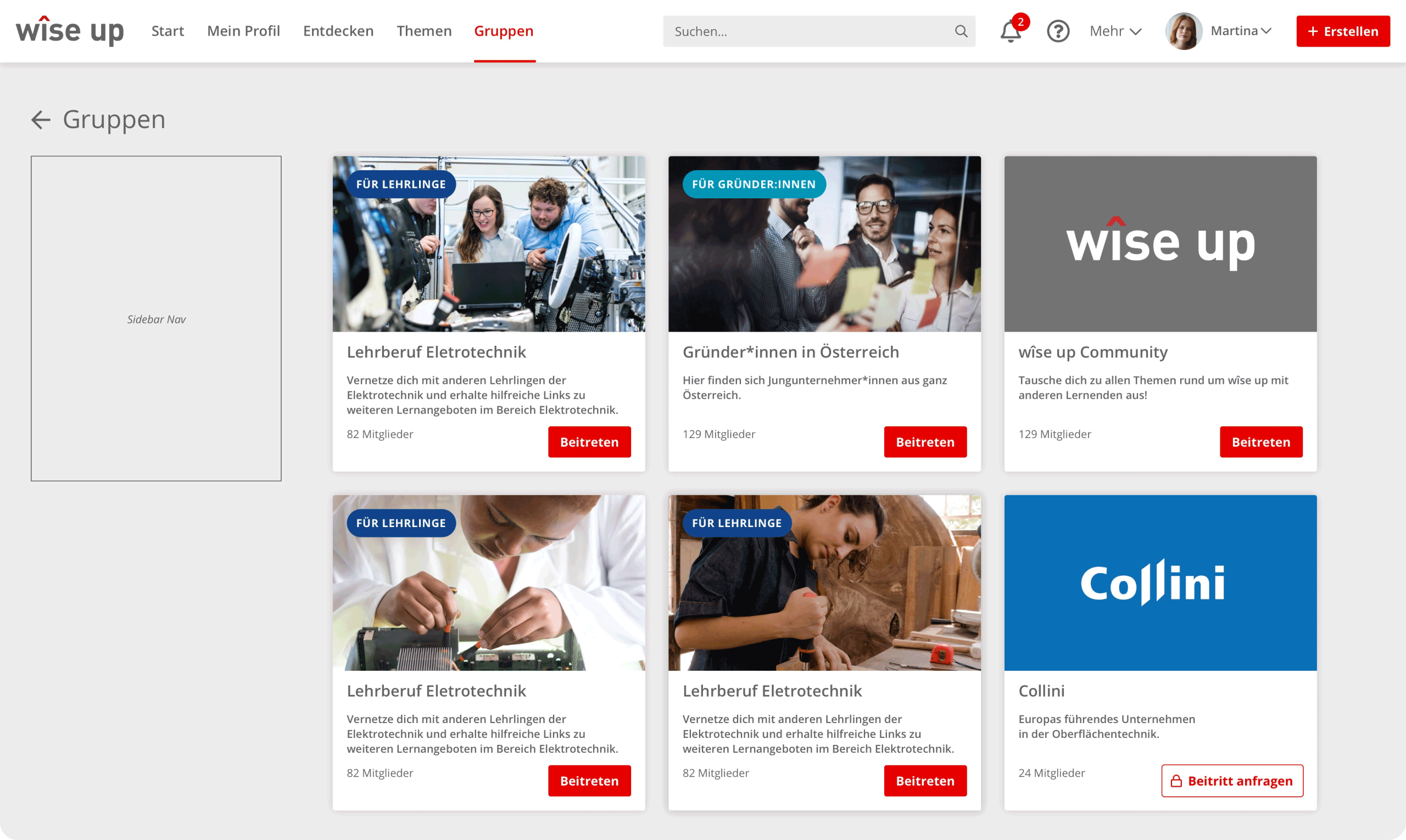
The “Groups” area displays learning groups as cards – helping users find communities or content relevant to their role, company, or shared goals.
Approach
From the beginning, the focus was on clarity and usability, both for learners and the people running the platform.
We started by auditing content and defining a modular IA that could support everything from structured learning paths to individual knowledge items. Categories, tags, and metadata were mapped to support both search and exploration. We also introduced clear entry points like “Start learning” or “Explore topics” that match common user needs.
On the navigation side, we designed a simple, scalable structure using clear language and consistent page layouts. Contextual navigation was added inside learning paths to support next steps, and templates were created to mix curated content with user-driven discovery.
To support content teams, we developed a knowledge strategy with editorial guidelines, tagging logic, and naming patterns. This helped internal contributors and external partners manage content more easily, and keep the platform sustainable as it grows.
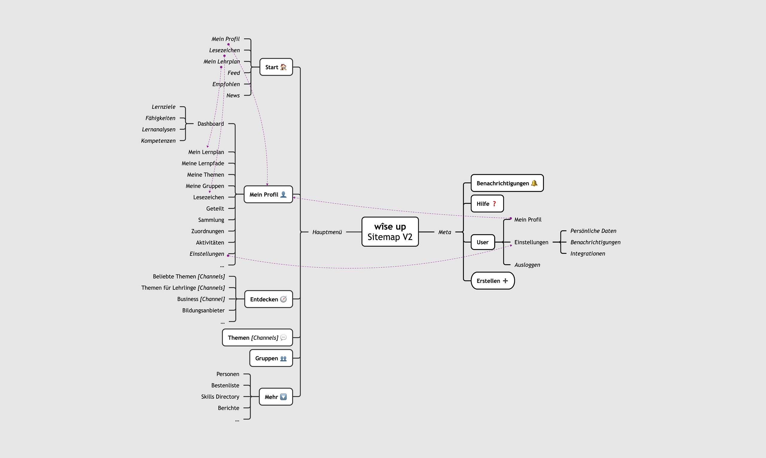
The sitemap showing the core structure of the platform, with built-in flexibility for future expansion and integration of new content types.
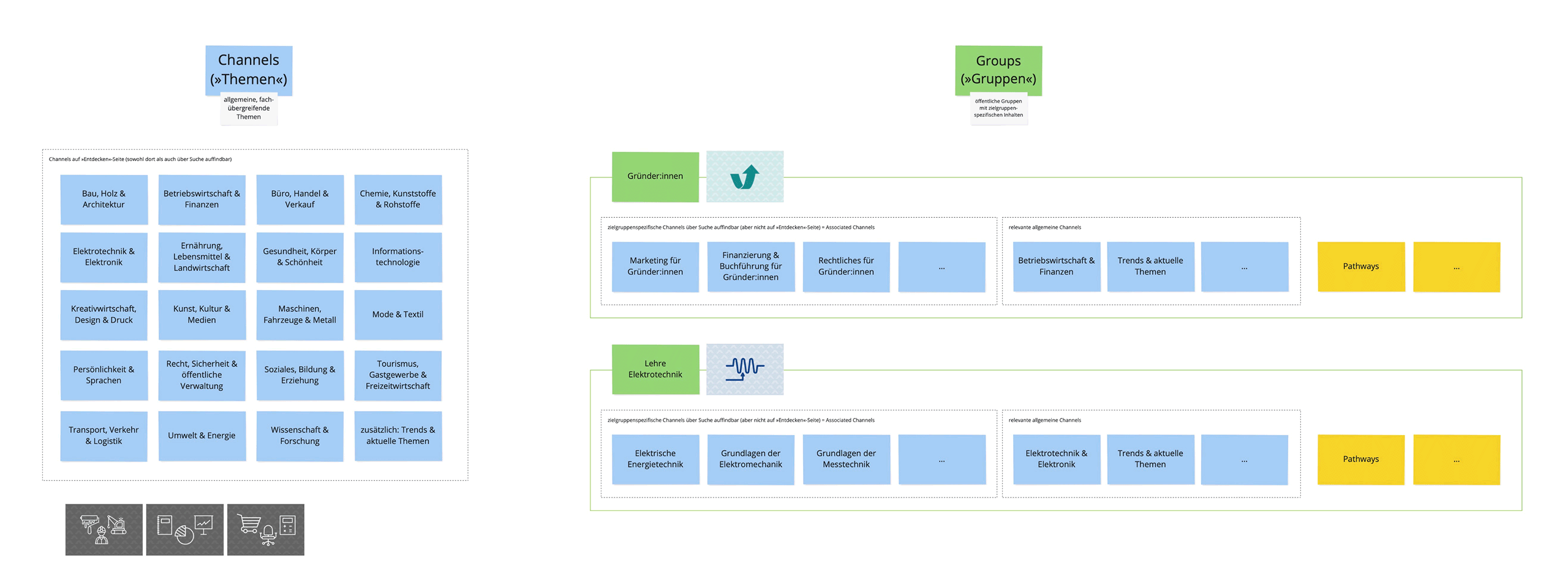
This diagram outlines the content logic behind channels and groups, serving as a practical reference for managing, tagging, and publishing content.
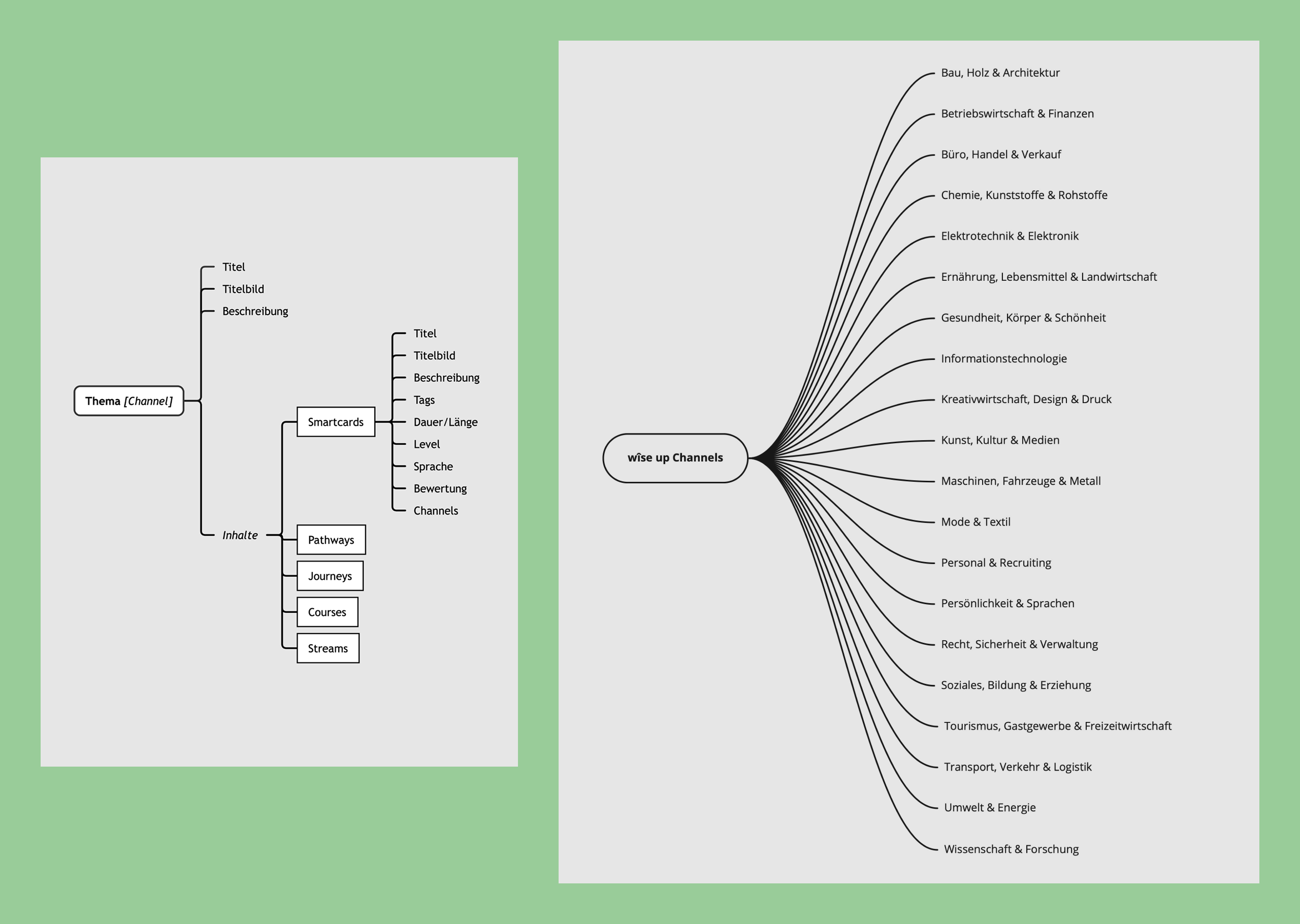
These deliverables show the breakdown of channels by sub-levels and themes, including how they map to official Austrian job categories for better alignment and clarity.
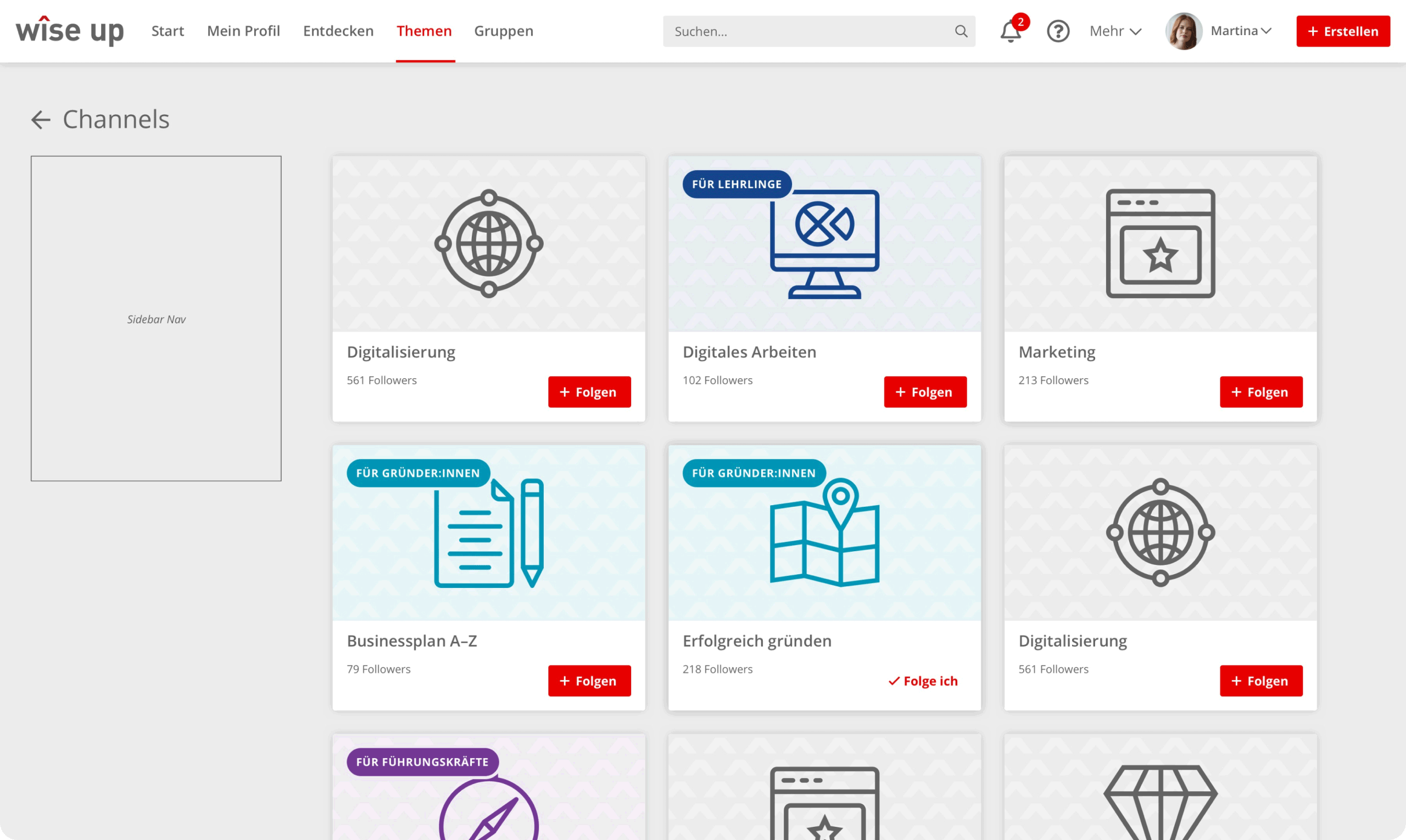
A view of the “Topics” page, presenting learning topics as visual cards to support quick orientation and exploration by interest or focus area.
Some questions that shaped the work

How can users quickly find the right learning without getting lost?
We designed clear entry points like “Start learning,” “Explore topics,” and “What’s new”, tailored to different user intentions. The navigation and structure guide people whether they arrive with a specific goal or just want to browse. Metadata, tagging, and consistent content patterns make it easier to access relevant content.

How do you build meaningful structure on top of an existing tech platform?
EdCast came with predefined logic, but we shaped a usable architecture by working within its constraints. We defined templates, refined category logic, and used metadata creatively. The goal was to make the structure feel seamless for users, even if the backend had limitations. We focused on clarity, consistency, and scalability.

How can internal teams manage a growing platform without friction?
We developed a simple set of rules and workflows – including naming conventions, tagging practices, and content review steps – that help teams keep the platform organized. This made it easier to onboard new contributors and ensure quality without creating unnecessary overhead. The structure now supports both internal and external content partners.
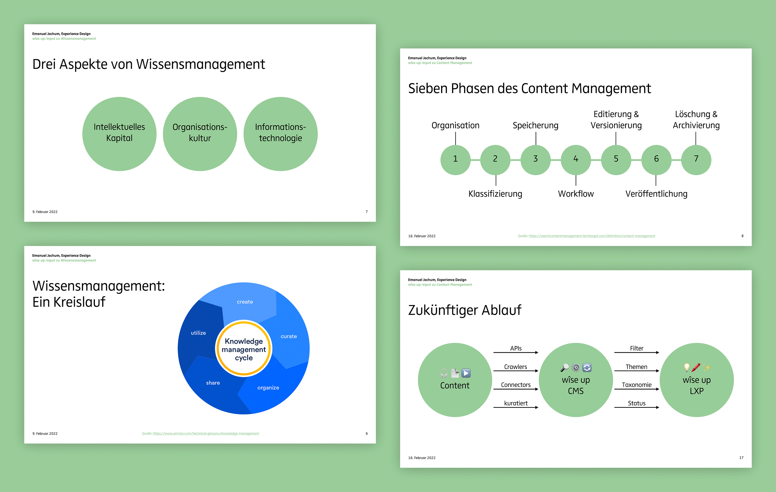
Some slides summarizing key suggestions for structuring and managing content, used by the internal team to define workflows and responsibilities.
Result
The platform launched with a clear and consistent information architecture. Learning content is now structured in a way that supports fast orientation, discovery, and long-term relevance.
Users can access learning based on where they are: starting new, continuing something, or exploring topics. The navigation feels straightforward, and the content feels organized, not overwhelming.
Behind the scenes, the editorial and technical teams now have a shared structure to work with – one that makes it easier to publish, maintain, and grow. The result is a platform that feels both flexible and focused.
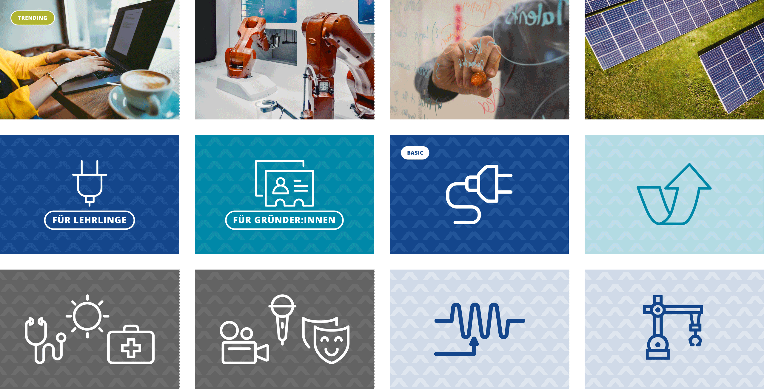
This set of 12 sample visuals illustrate the visual logic for channel cards and show how colour, illustration, and iconography support orientation.
What I contributed
Definition of the information architecture and navigation logic
Creation of templates and page structures aligned with user journeys
Advice on knowledge management and editorial workflows
Worth a mention
Designing structure on top of a pre-built platform like EdCast requires both clarity and patience. Getting internal teams on board early meant the system could grow naturally, and stay usable well beyond launch. The real success came from helping the team understand how the system works, so they could carry it forward on their own.
Building a platform or service that needs better structure?
Let’s bring clarity to your content and help people find what they need – with a structure that works today and grows with you.
Let’s make something meaningful.
Emanuel Jochum, Experience Design
Rotenturmstraße 27/2, 1010 Vienna, Austria
+43 699 17191982, hello@ejochum.com
© Emanuel Jochum, 2026
Simple is beautiful