Website navigation and search for MyPlace
Building clearer paths to the right place
Together with Marion Birringer, I helped restructure the website navigation and redesign the storage unit search for MyPlace so people can easily find, compare, and book the right space as locations and services continue to grow.
Facts
Client
SelfStorage Dein Lager LV GmbH
Commissioned by Marion Birringer/subrosa
Team
Hristiyan Rizov
Claudia Behr
Lisa Schlichting
Marion Birringer
Emanuel Jochum
My role
User experience design
User interface design
Period
2023–2024
Sector
Self-storage services, logistics
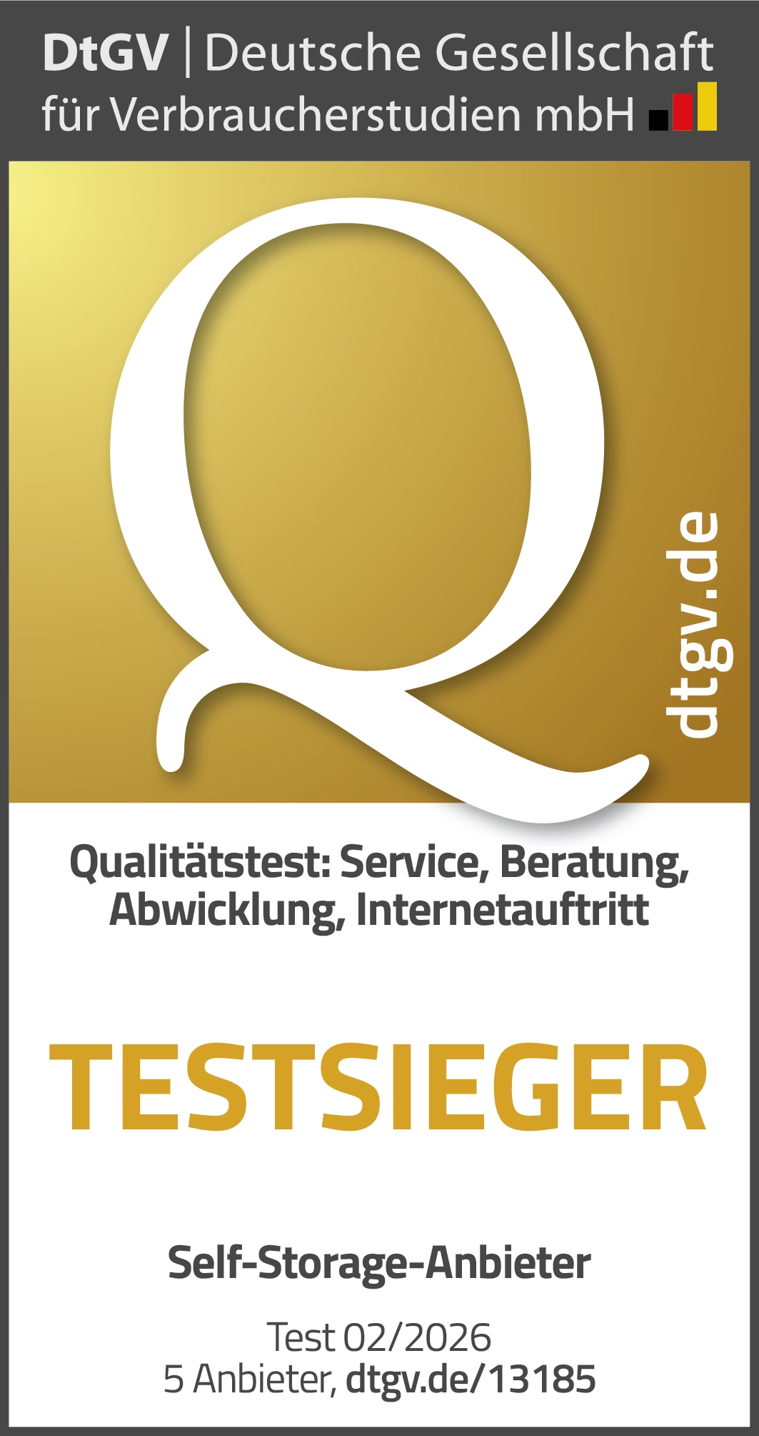
MyPlace rated best
In February 2026, the MyPlace was rated 99.0% (“Very Good”, 1.1) for its internet presence in a study by DtGV – Deutsche Gesellschaft für Verbraucherstudien, highlighting improvements in clarity, navigation, and usability.
Challenge
MyPlace operates over 60 self-storage sites in Austria, Germany, and Switzerland – with more opening soon. The old navigation struggled to handle this growth. It was dense, making it hard for people to find the right storage unit or compare multiple locations, especially in large cities like Berlin.
At the same time, the website needed to cover more than just bookings – it had to handle information, service tools, and company content too. The goal was to create a clear, flexible structure and a faster, friendlier search experience that works for anyone, on any device.
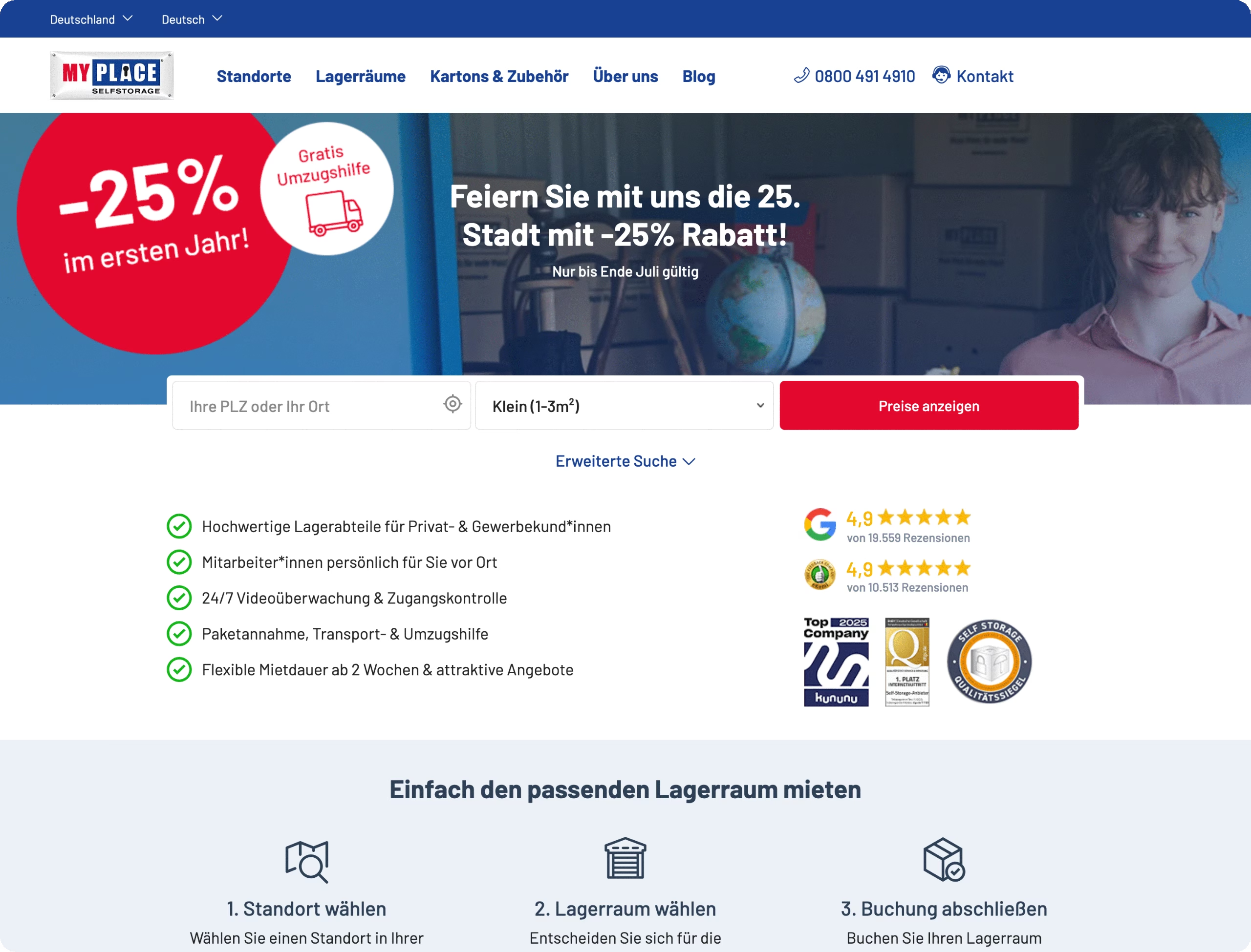
The homepage shows the calm, clear header with the main navigation and a prominent search bar that helps people get started right away.
Approach
We tackled the navigation and the storage unit search iteratively, as separate but connected work packages. By mapping user journeys, building detailed sitemaps, and planning needs-based content, we kept the focus on what people really want to do.
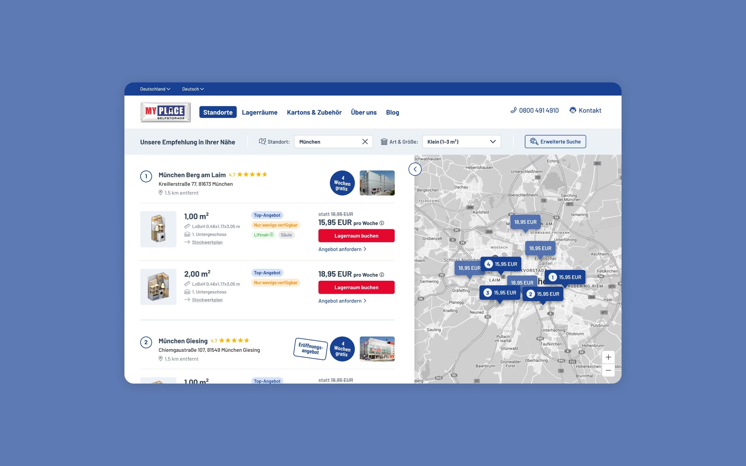
For cities with lots of MyPlace locations, we built expandable location lists with a clear map view for quick orientation. The search tool now combines a list view for comparing details and a map view for seeing locations nearby.
Filters, calls to action, and fallback options help people stay on track – even if their first choice isn’t available. Critical actions like “Show prices” or “Contact” are always within reach.
The visual design is calm and easy to scan, works well on any screen size, and scales easily for new locations or services.
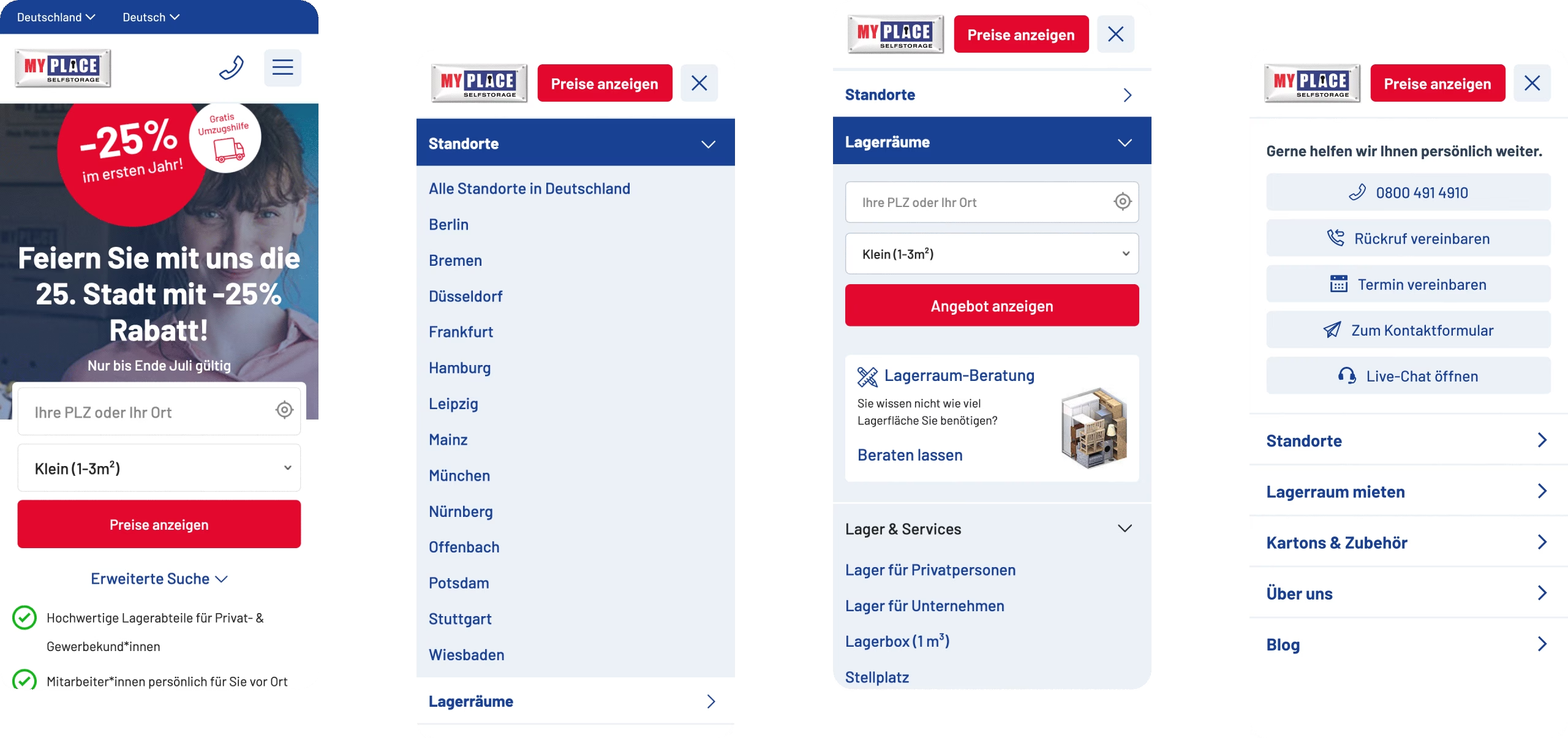
These views show the smooth navigation: finding a location, exploring storage options, and getting in touch – all easy to do on the go.
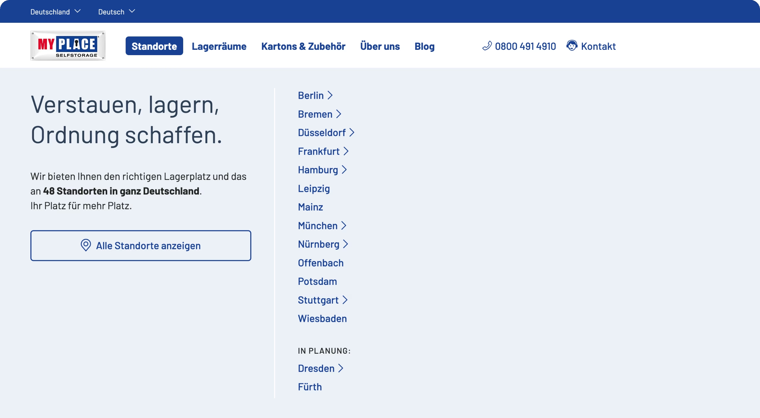
The “Location” section guides people to city pages, includes a button to view all locations, and sets the tone with a short intro.
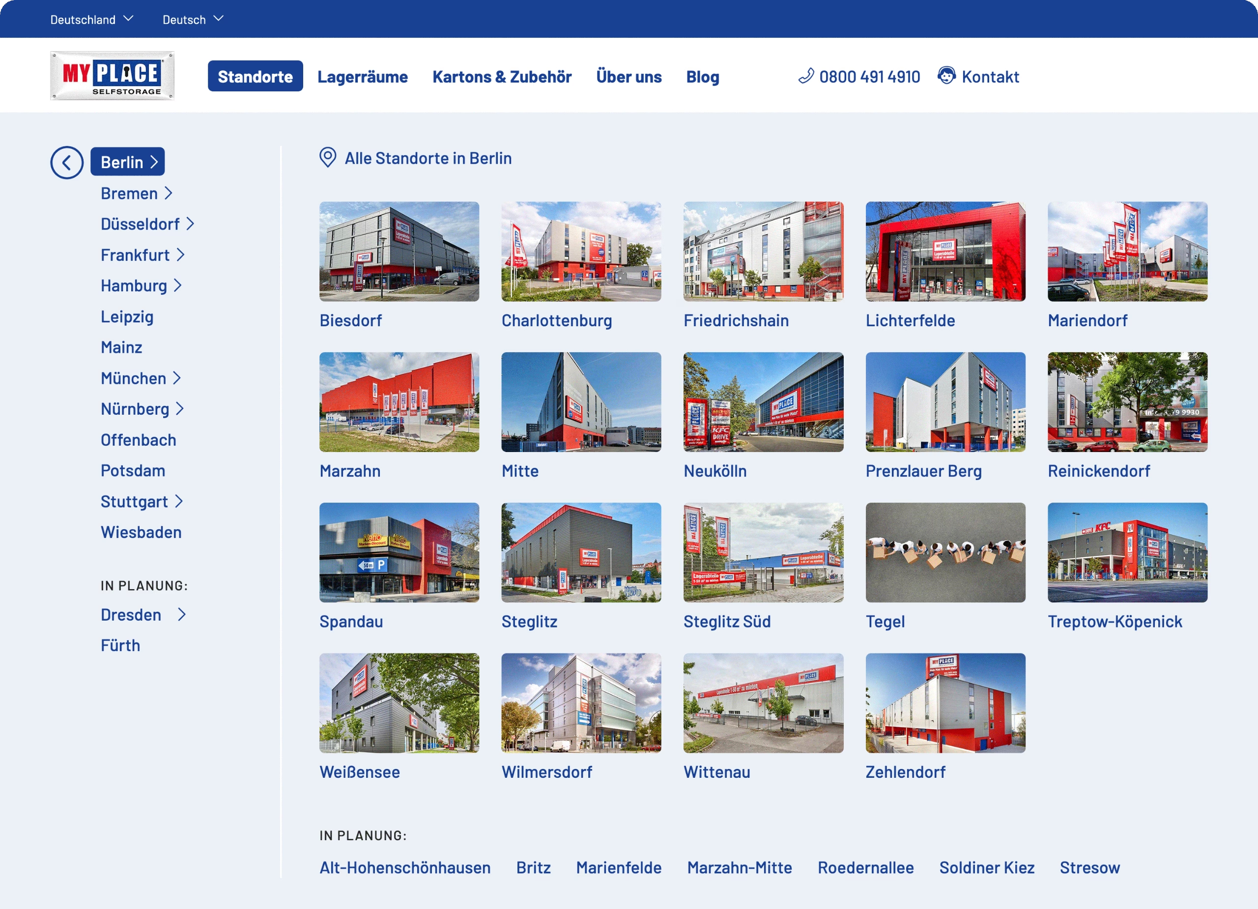
The “Location” section shows all 19 locations in Berlin – clear, tidy, and easy to browse.
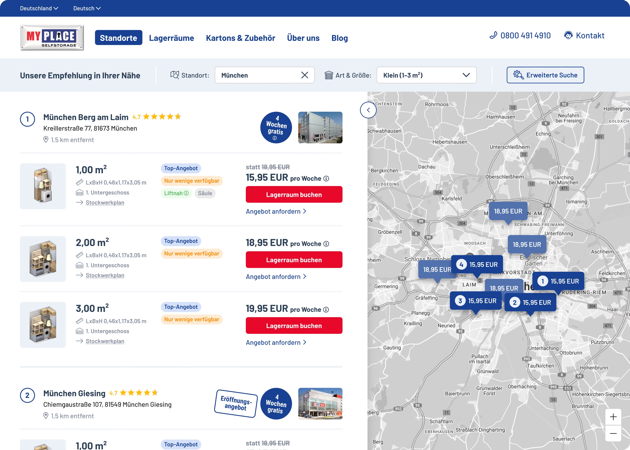
The list and map view work together, showing all available units so people can scroll through details and see locations at the same time.
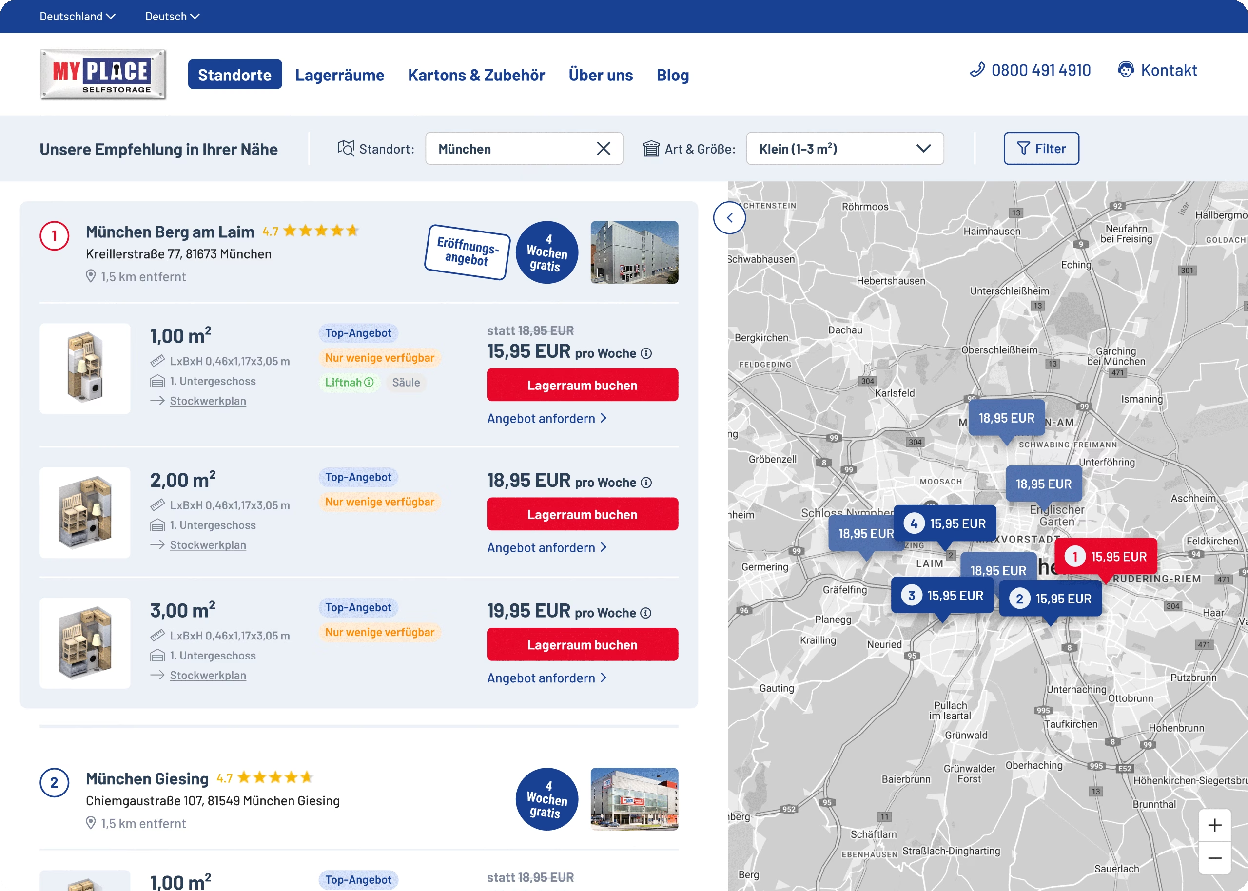
The split view highlights how users can select a location and see details side-by-side with the map for faster, more confident choices.
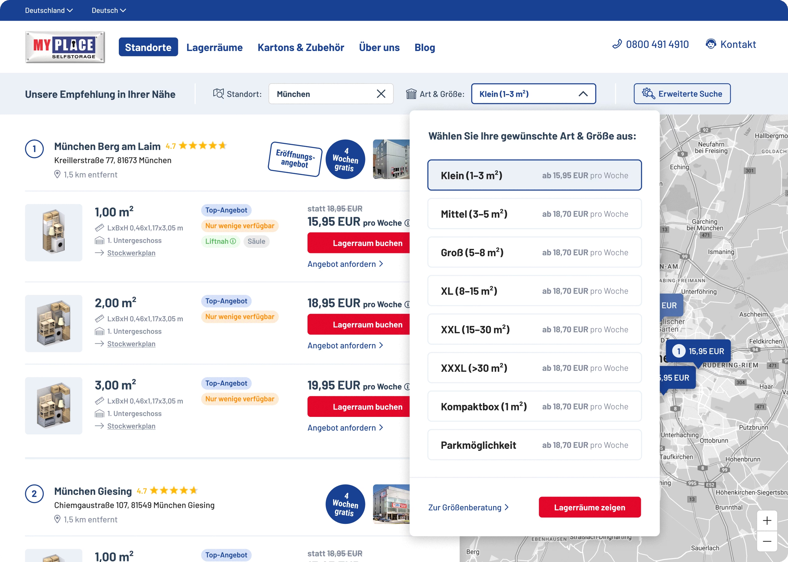
This overlay makes it easy to select or change the type and size of a storage unit, keeping the flow clear.
Some questions that shaped the work

How do we help people choose the right storage location in a city with many locations?
We grouped all sites by city, added clear expandable lists, and paired them with an interactive map view. This makes it simple to compare locations and pick what’s best without getting overwhelmed.

How can we guide people to book without feeling lost?
We focused on what really matters: comparing sizes, checking prices, and seeing availability. Shorter flows, clear buttons, and no hidden steps make it quick and stress-free.

How do we keep the system future-ready?
Everything is modular: New locations, services, or tools can be added without breaking the structure. That means less rework for the internal team later on.
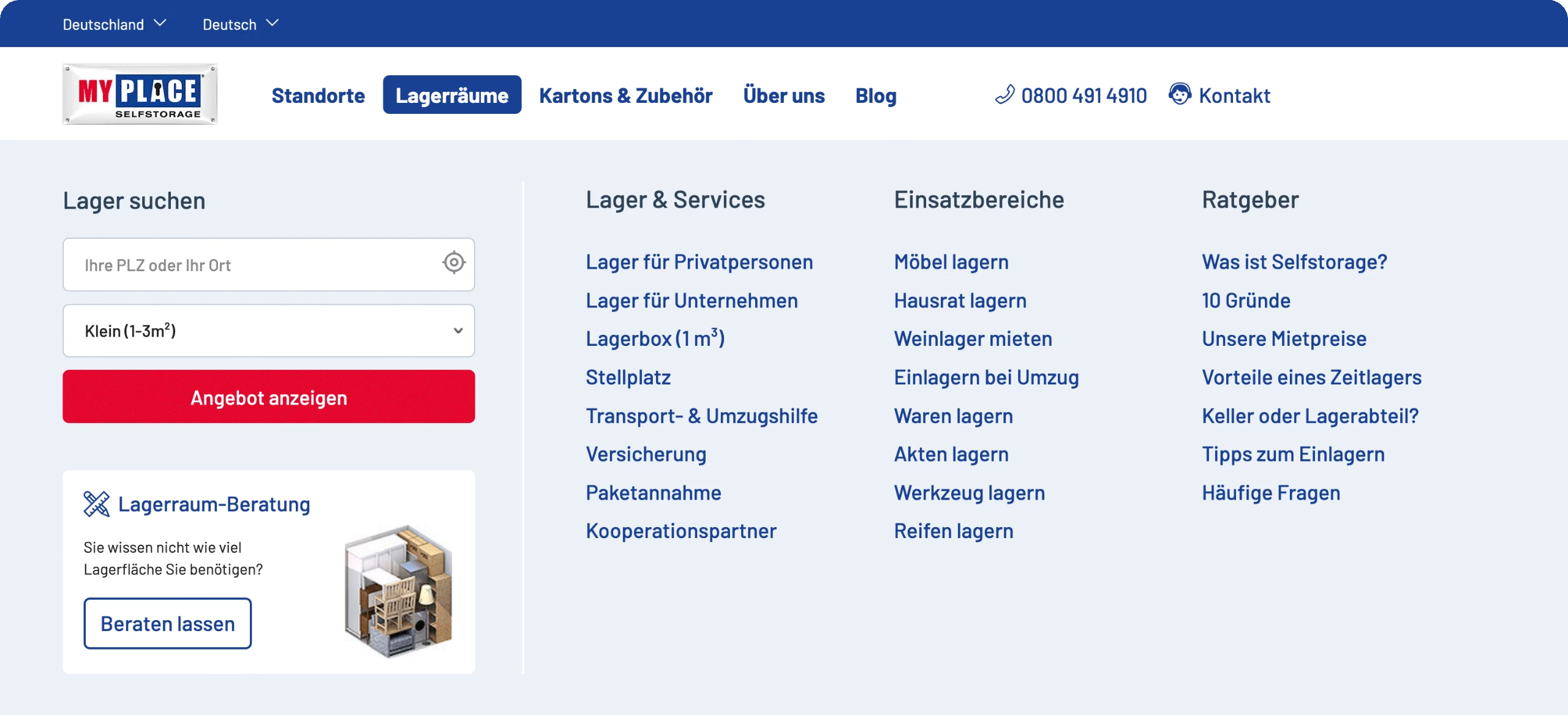
The “Storage Units” section opens to a helpful search mask and quick links for special needs, from business storage to practical guides.
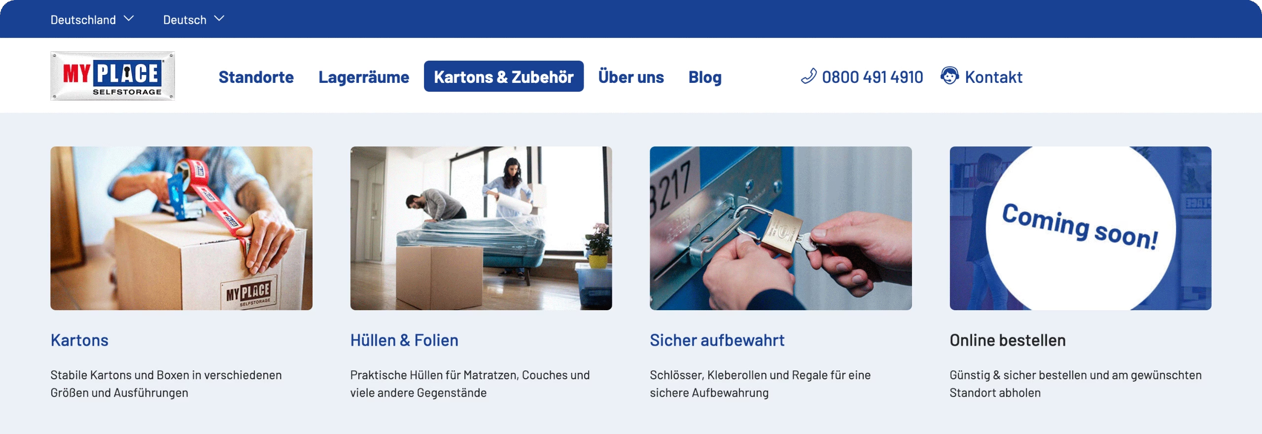
The “Cardboards & more” section gives a quick peek into subcategories, showing that MyPlace is more than just storage.

The “About us” section in the navigation includes an intro and event teasers, adding a friendly human touch.
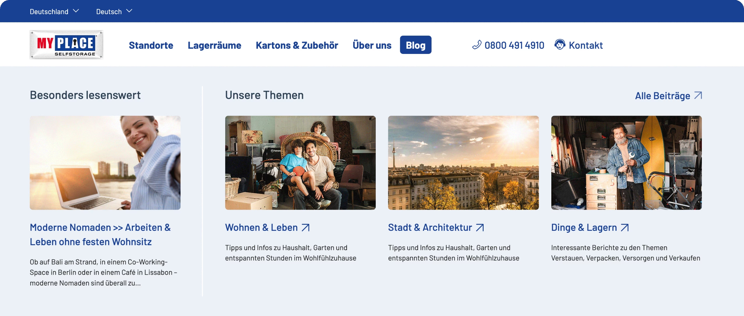
The “Blog” section connects visitors directly to helpful articles in the MyPlace blog “Platzprofessor”.

The “Contact” section keeps all contact options visible and simple, so help is always just one click away.
Result
The new navigation and search experience now make it easy to find the right location, compare options, and book a storage unit confidently. People can get prices, check availability, and switch between list and map views without losing track.
Tests showed that visitors find what they need faster and stick around longer – leading to higher conversions and fewer calls to customer support.
The brand-aligned design works equally well on desktop screens and mobile devices, ensuring people get the same helpful experience wherever they are. And because the structure is flexible, it’s ready for more locations and services in the future.
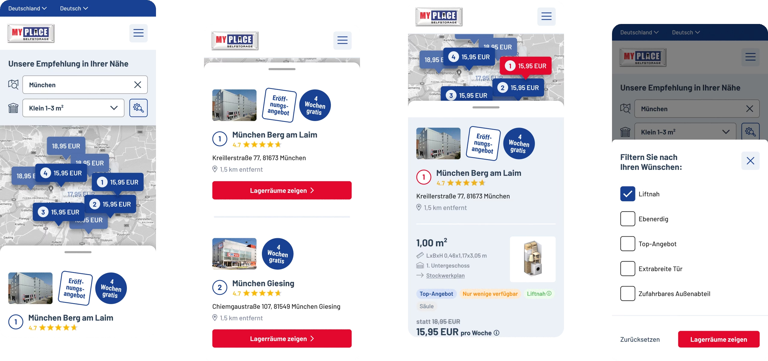
These mobile views show how the search results, location options, unit details, and filters all stay clear and scroll-friendly on smaller screens.
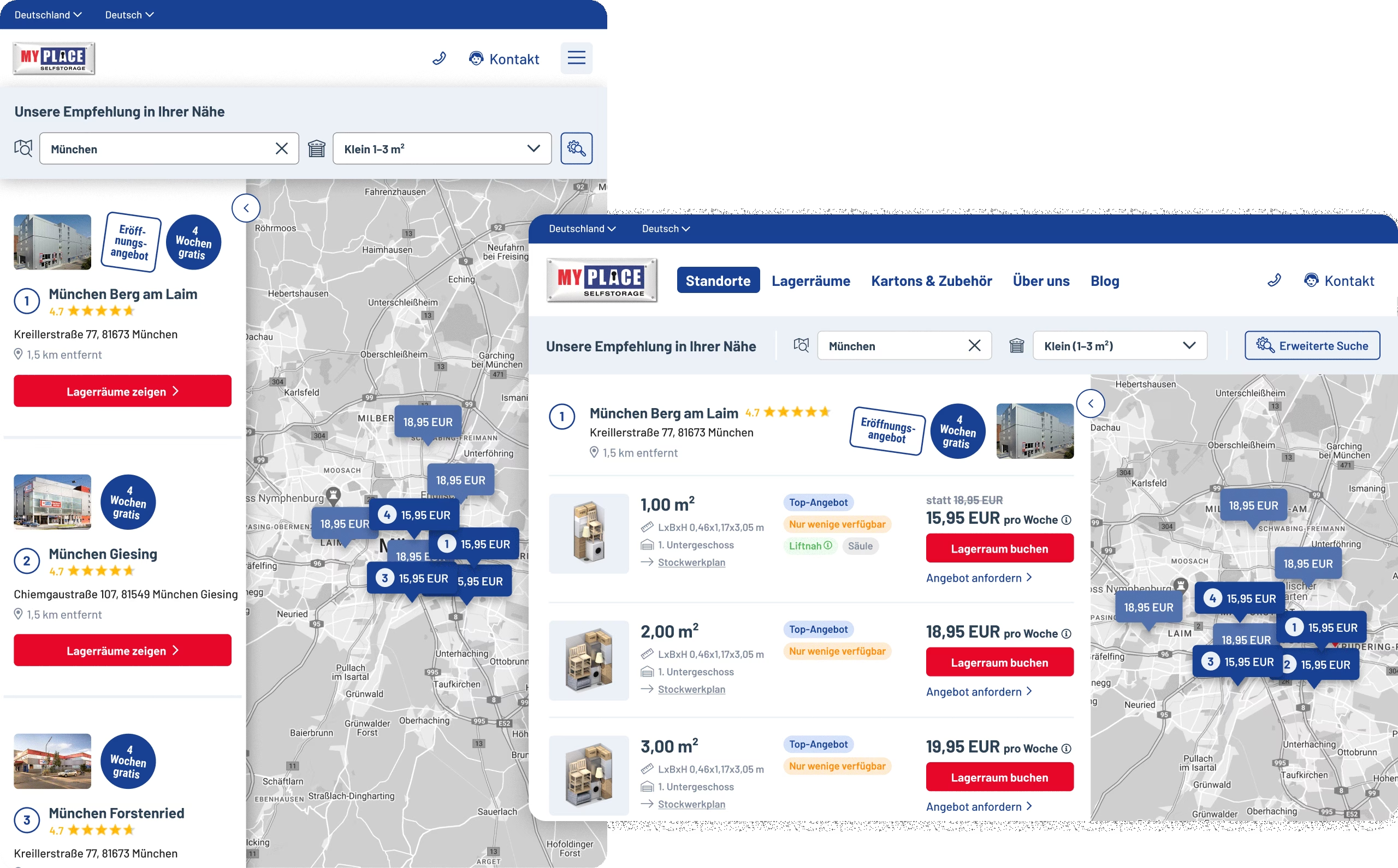
These tablet views show how the split view works just as well in portrait or landscape, proving the responsive design works wherever people need it.
What I contributed
UX design for structure and flows
UI design for menus, dropdowns, dual-view search
Support during implementation and refinement
Worth a mention
When navigation works well, it stays in the background and helps people feel guided without even noticing it. Especially when life is busy, a clear path means less stress and better decisions.
Got a growing service that needs clearer navigation?
I help turn complex structures and busy menus into clear, friendly flows – so your users find what they need and feel good doing it.
Let’s make something meaningful.
Emanuel Jochum, Experience Design
Rotenturmstraße 27/2, 1010 Vienna, Austria
+43 699 17191982, hello@ejochum.com
© Emanuel Jochum, 2026
Simple is beautiful