Website for LVA
Making complex services easy to access
With HEROK & friends, I designed a simpler, faster website that helps people find and understand LVA’s wide range of food and product analysis services.
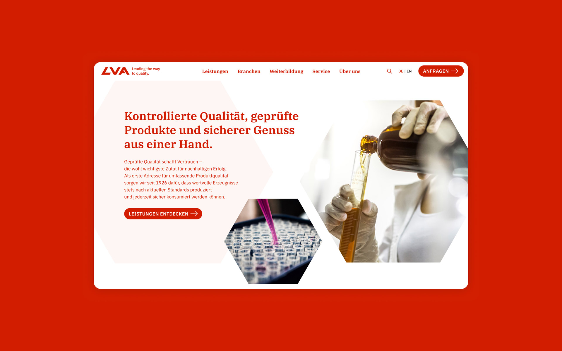
Facts
Client
LVA GmbH
Commissioned by HEROK & friends
Team
Dorothea Roubicek
Katrin Fischer
Teresa Medits
Reinhard Herok (account & project management, strategy)
Gerald Lauffer (concept, text)
Fabian Pimminger (development, technical support)
Emanuel Jochum
My role
User experience strategy
User experience design
User interface design
Period
2021–2022
Sector
Food & product analysis, B2B services
Challenge
LVA is Austria’s leading institute for analysis and expertise in food, pharmaceuticals, cosmetics, and food supplements. Its services are wide-ranging, but the old website wasn’t reflecting that clearly.
The former site was outdated, slow, and overloaded with content. It was hard for visitors – especially B2B clients – to understand what LVA offers and how to get in touch with the right department. The redesign needed to create structure, focus, and clarity.
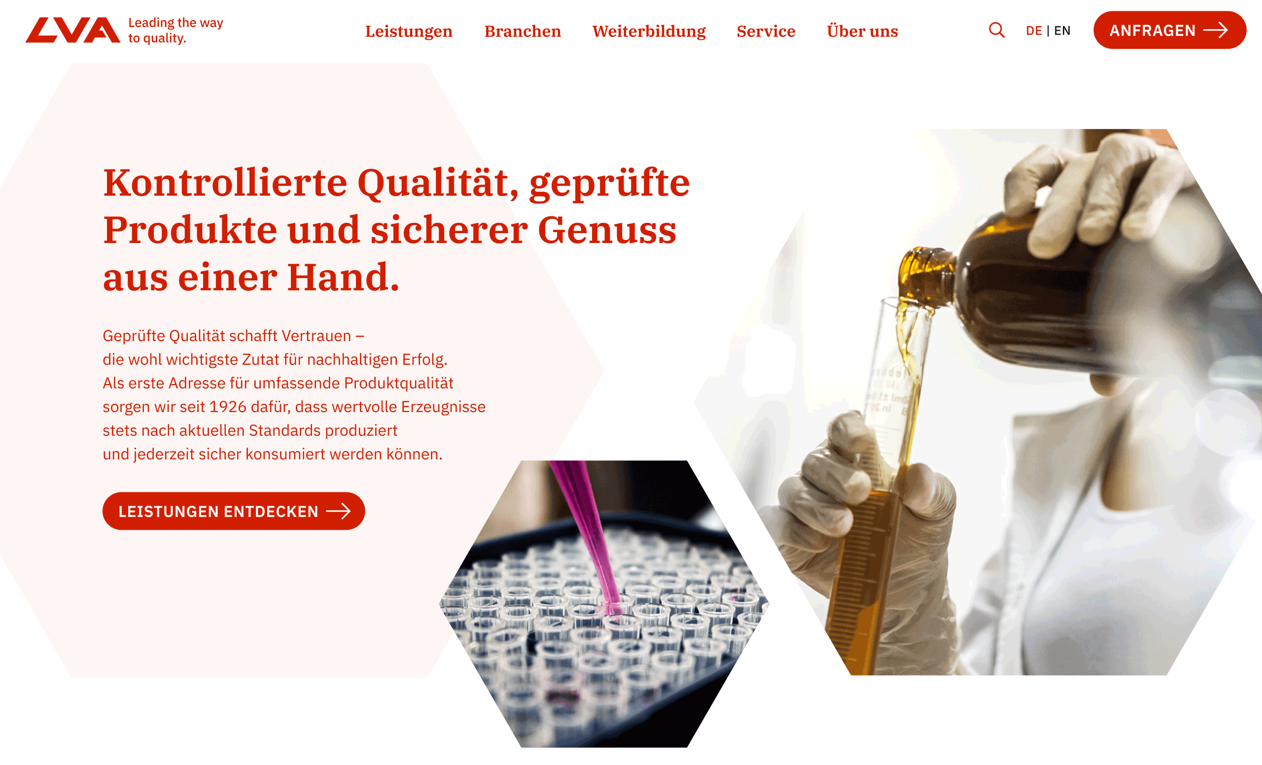
A fresh homepage that brings clarity to LVA’s offering – structured, calm, and built to guide visitors to the right services from the start.
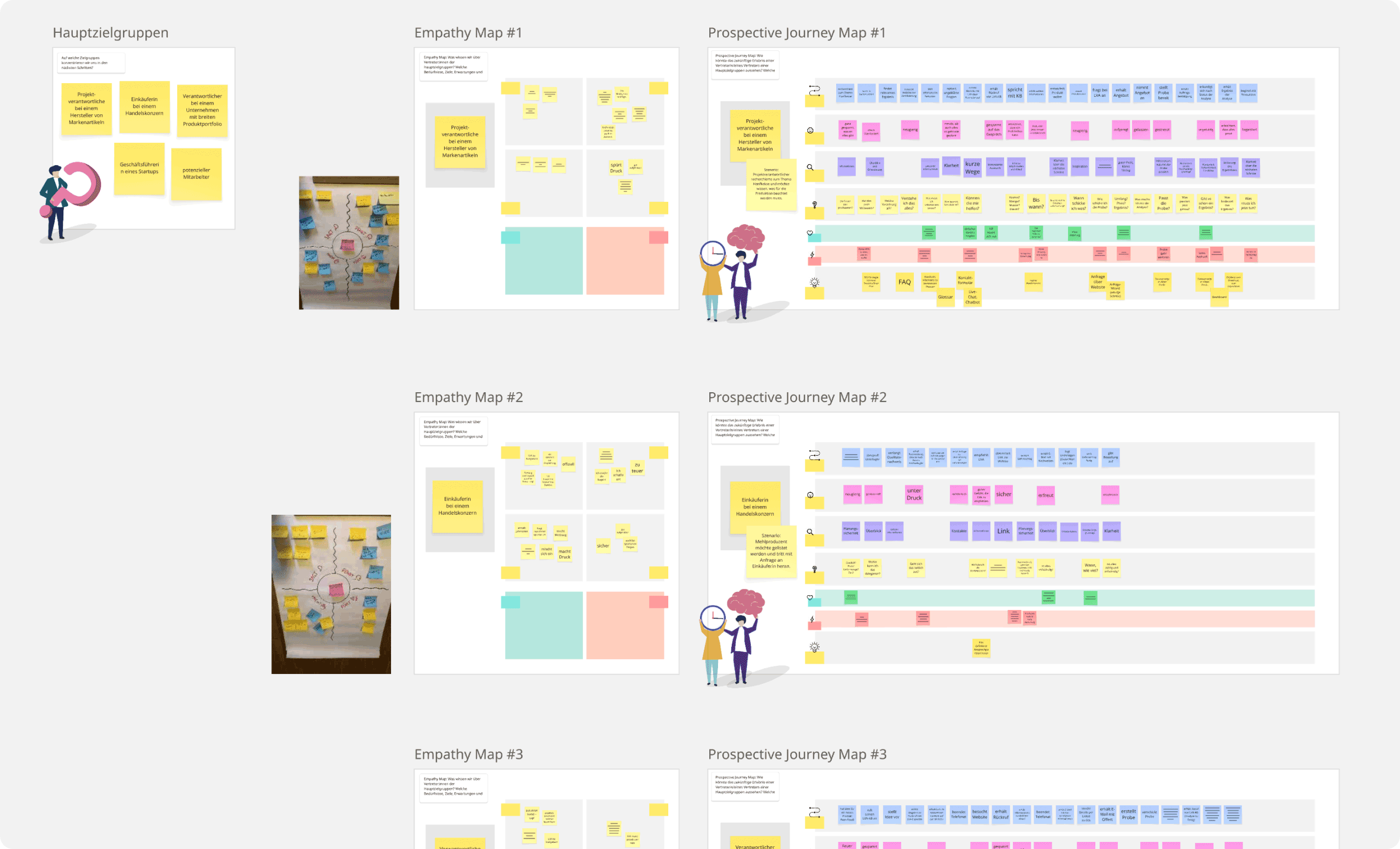
Detailed empathy and journey maps helped structure the website around real user motivations and content needs.
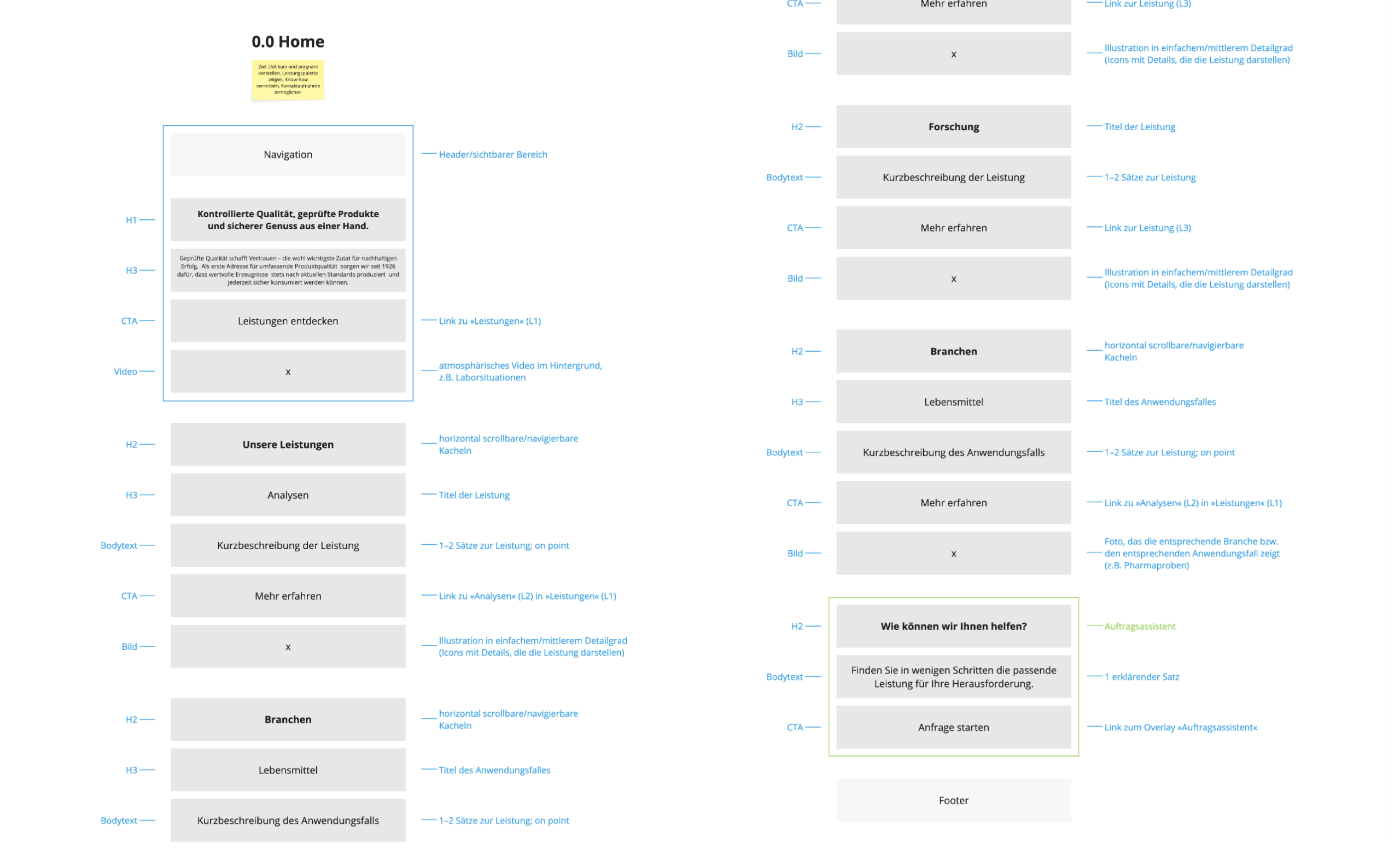
Priority guides helped define structure and flow by putting user goals and essential content first.
Approach
The goal was to simplify without losing depth – and to build a user experience that makes LVA’s expertise visible, trustworthy, and easy to access.
The focus was on restructuring the navigation to reflect how potential customers actually look for services, creating clear entry points based on service areas and user needs.
A modular design system supports different content types and future updates, while the responsive interface ensures consistency from desktop to mobile.
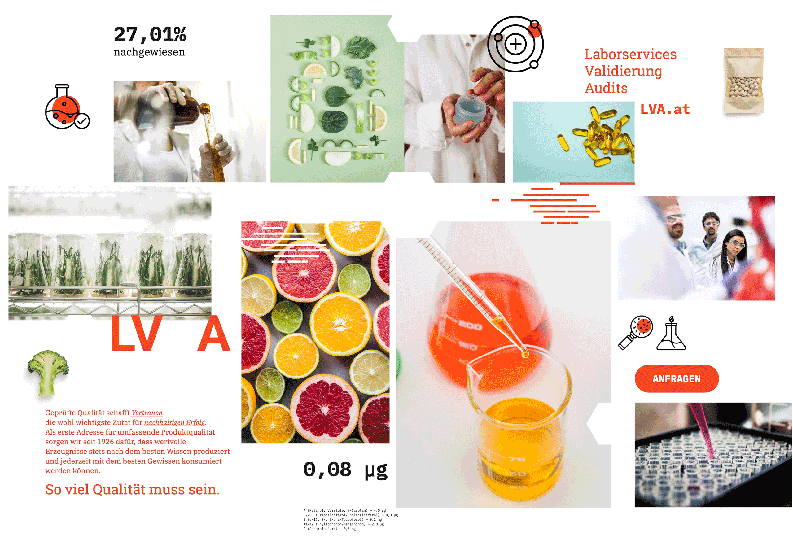
The moodboard captures the visual direction of the website – colourful, clear, and designed to feel both approachable and professional.
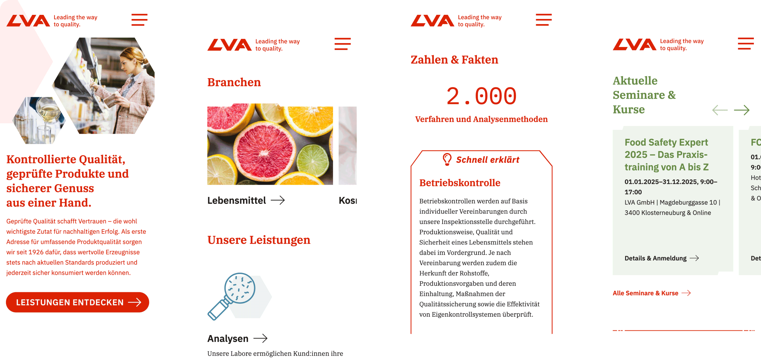
Mobile-first layout with reusable content modules and direct access to relevant services.
Some questions that shaped the work

How can we reduce the amount of outdated or redundant content?
A content audit helped identify and consolidate duplicate or outdated pages. We worked with the internal team to prioritize substantial content and service pages.

How can the website serve different types of B2B customers, from large manufacturers to small startups?
We created clear entry points per target group and used simple language with clear CTAs, avoiding overly technical phrasing across the website.

How does the website support fast, focused inquiries for customer service?
We designed a dedicated inquiry workflow with fewer clicks, clear form logic, and sticky access (via main navigation) across the website for quick action. Additionally, we made a concept for a self-service flow for new requests.
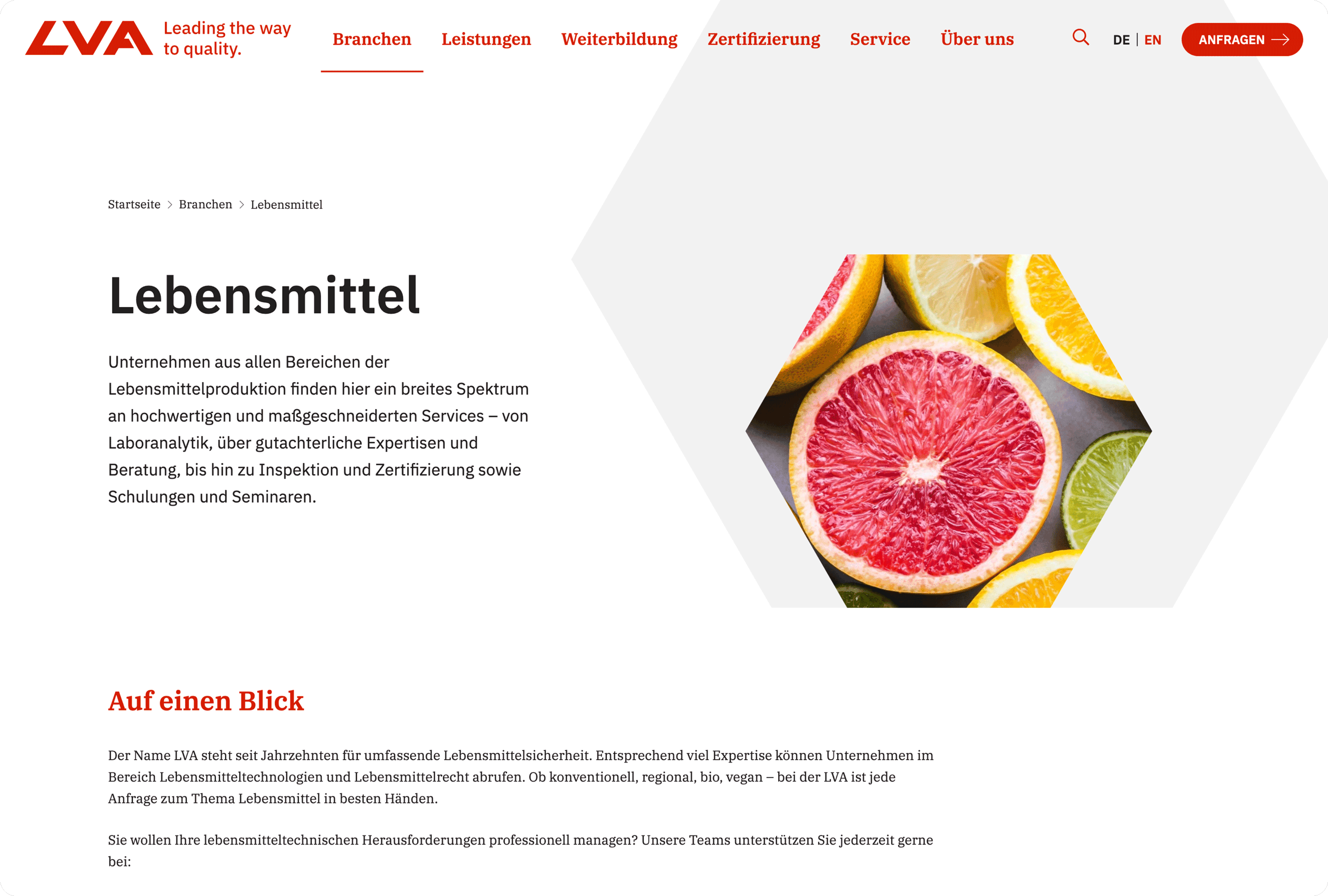
Dedicated pages offer a clear starting point for exploring LVA’s services by industry – focused, informative, and easy to understand.
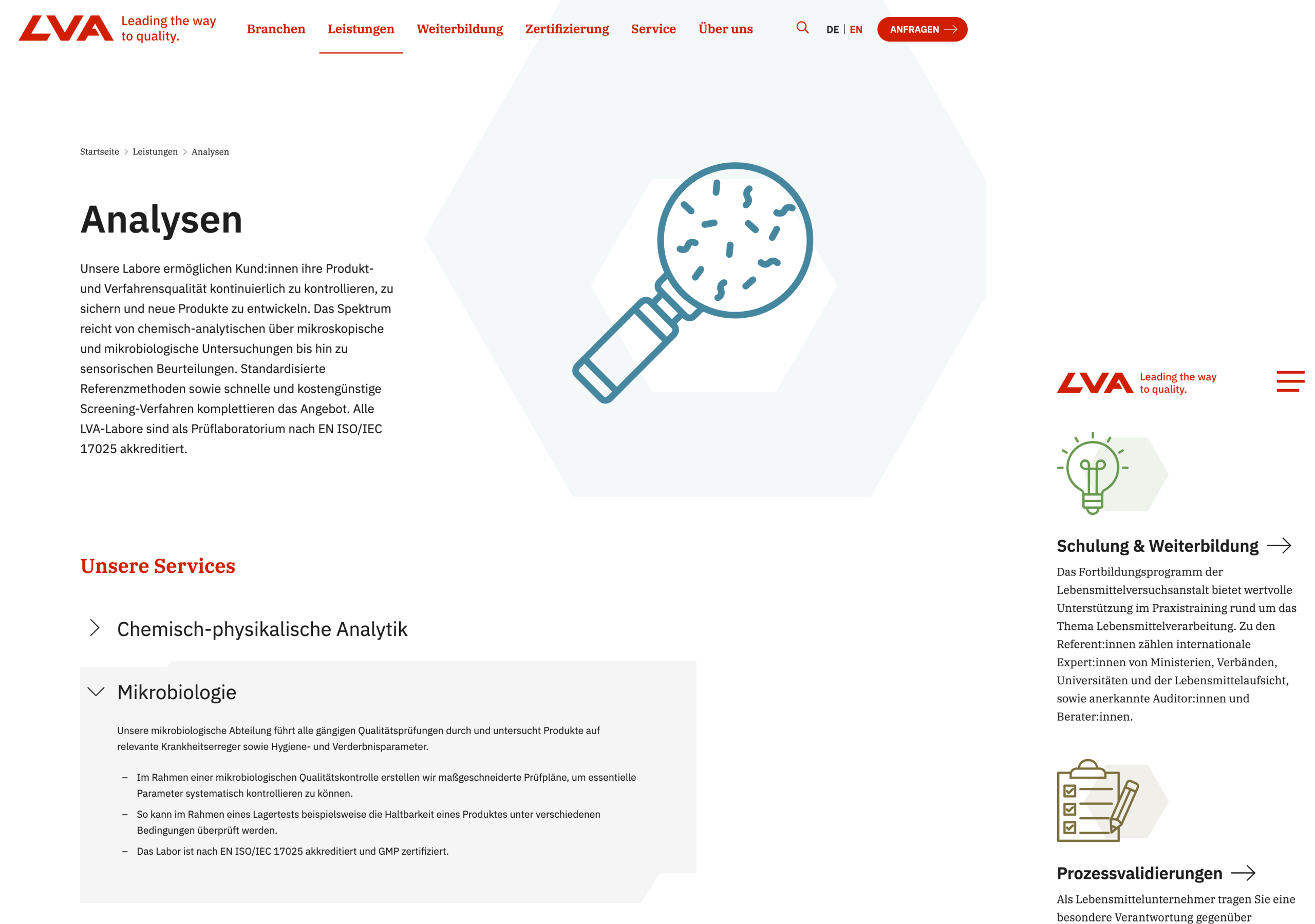
A flexible visual and layout system designed to adapt across devices and scale as content grows.
Result
The new site is fast, clean, and easy to use. Key outcomes include a streamlined structure with service-first navigation and a stronger visual hierarchy for better orientation. It features a calm, brand-aligned look and feel that works across devices and use cases.
The site offers improved clarity for potential clients searching for specific tests or services, provides a better overview of the courses along with smooth booking, and allows for easier content management by the internal team.
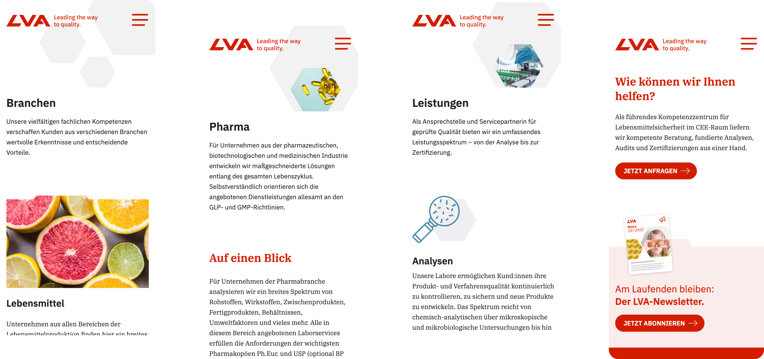
The service overview groups offerings by industry relevance, helping users navigate without technical knowledge.
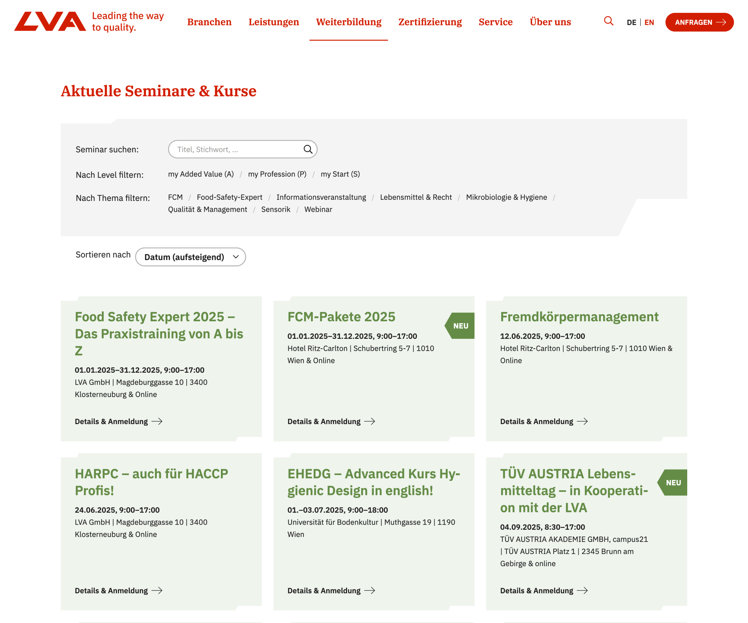
A compact, scrollable seminar view showing the current programme and registration options at a glance.
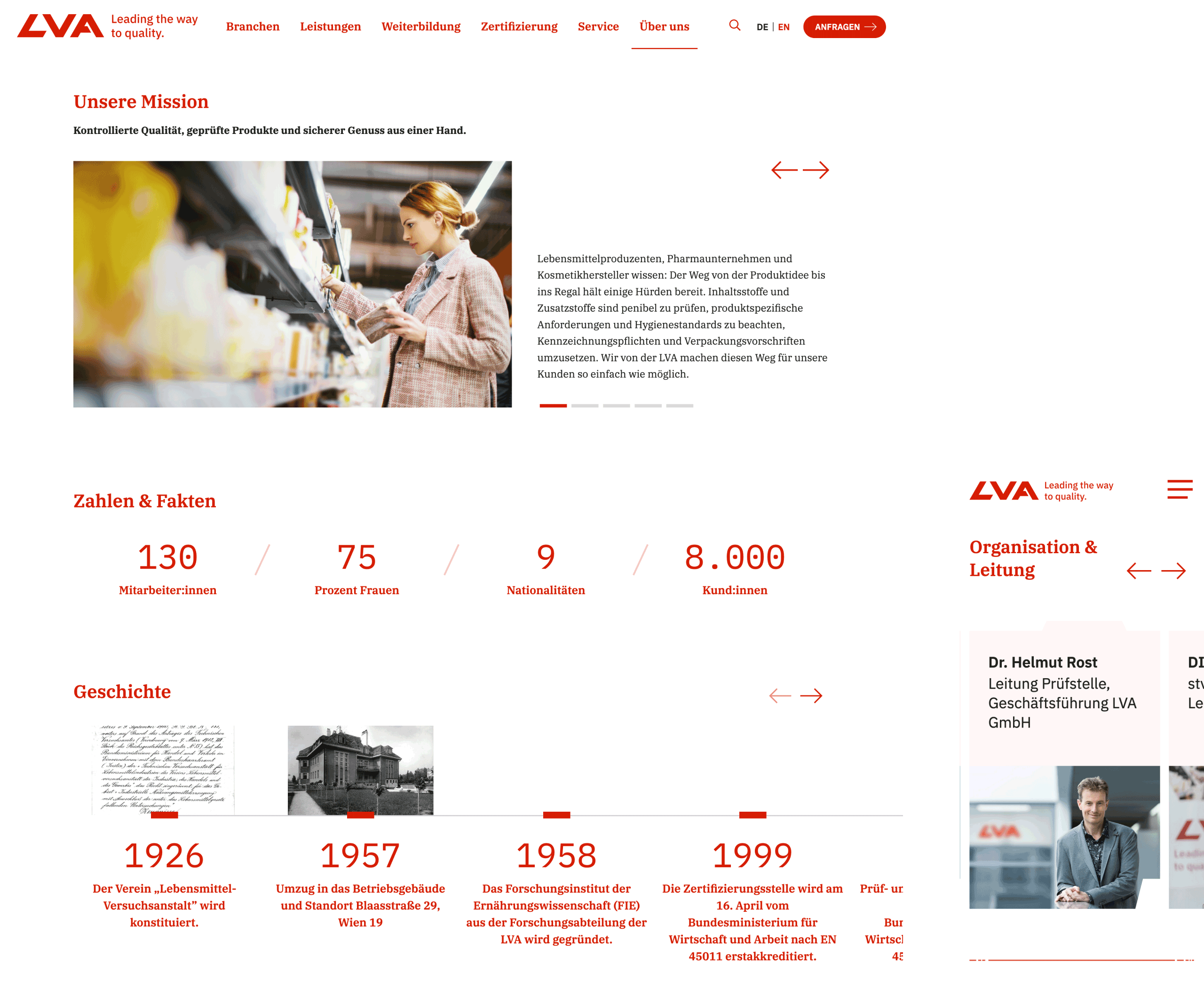
The company profile brings LVA’s mission, leadership, history, and people into focus – with facts, milestones, and a calm, confident layout.
What I contributed
UX concept
Information architecture
Prototyping based on priority guides
UI design
Support during implementation and refinement
Worth a mention
In highly scientific or specialized industries, clear structure is essential – not only for usability, but to build trust. A calm, well-organized website helps position expertise as approachable and actionable.
Got a complex service or product to explain?
Let’s simplify the story and organize the details, making it easy for your audience to understand what you offer and why it matters.
Let’s make something meaningful.
Emanuel Jochum, Experience Design
Rotenturmstraße 27/2, 1010 Vienna, Austria
+43 699 17191982, hello@ejochum.com
© Emanuel Jochum, 2026
Simple is beautiful