femSense App
Supporting cycle tracking with clarity and care
The femSense app’s design evolution focused on aligning UX and UI with real user needs – blending precision with a supportive and emotionally aware experience.

Facts
Client
SteadySense GmbH, femSense business unit
Team
Sarah Lechner (head of business unit, project lead)
Christina Capellari (communications, content strategy)
Daria Akoshali (growth strategy)
Denise Huber (customer service)
Jakob Maierhofer (app development)
Karl Strohmayer (product development)
My role
Research, UX design, UI design
Duration
2023–2024
Sector
Femtech, digital health
Website
femsense.com
Challenge
femSense is a smart, sensor-powered solution that helps users track their menstrual cycle, fertility, and temperature with medical-grade accuracy. After several successful product iterations, the team set out to refresh the brand and product – aiming to create a more supportive and emotionally aware experience.
The challenge was to align the UX and UI with this new direction, while preserving the accuracy and trust that existing users relied on. The goal was to guide the team through a thoughtful design evolution rooted in real user insights and daily tracking habits.
Before & After
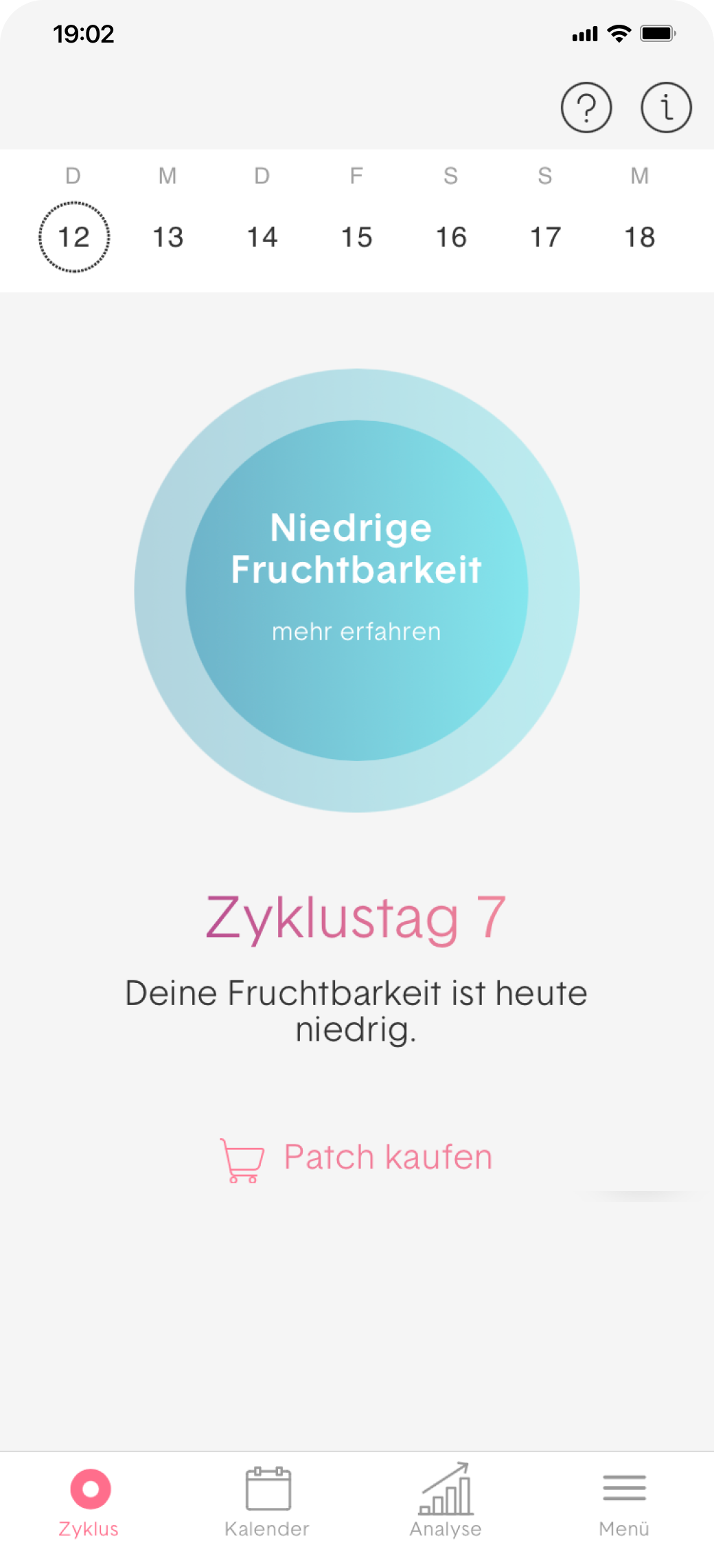
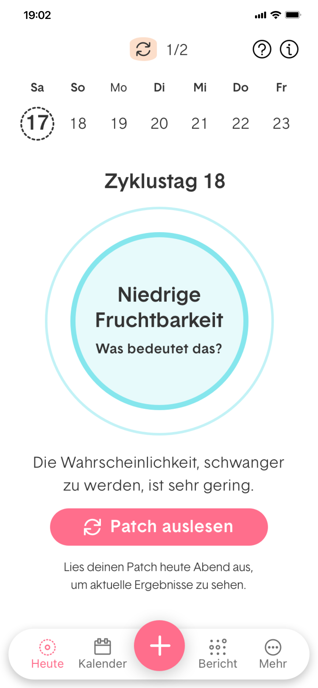
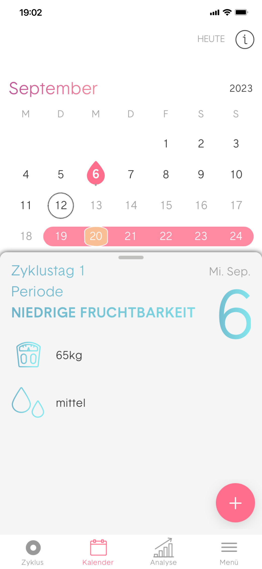
This update shows a calmer, clearer daily view. It’s about helping users understand where they are in their cycle.

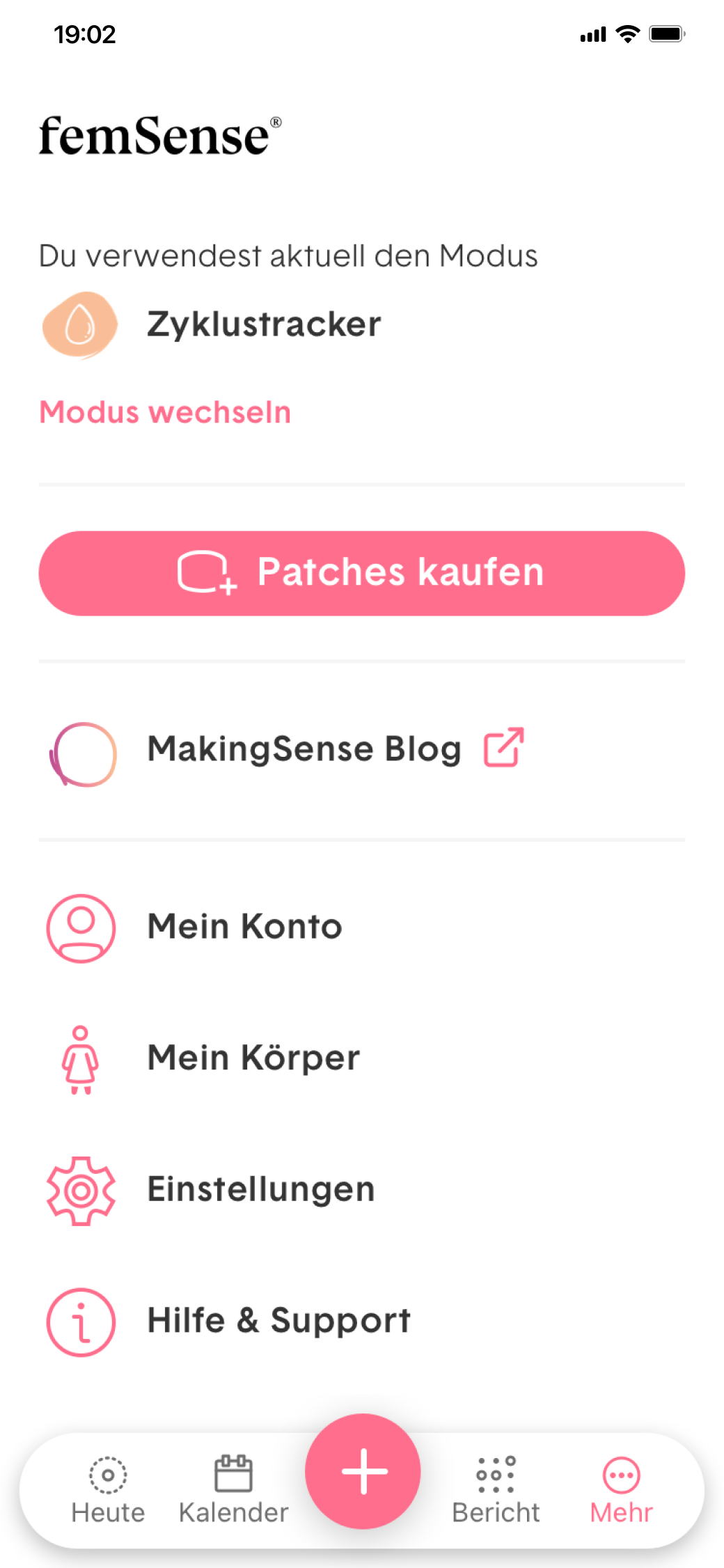
These screens show the heart of the app: the daily view with the sensor patch, helping users understand their current fertility status at a glance.
Before & After
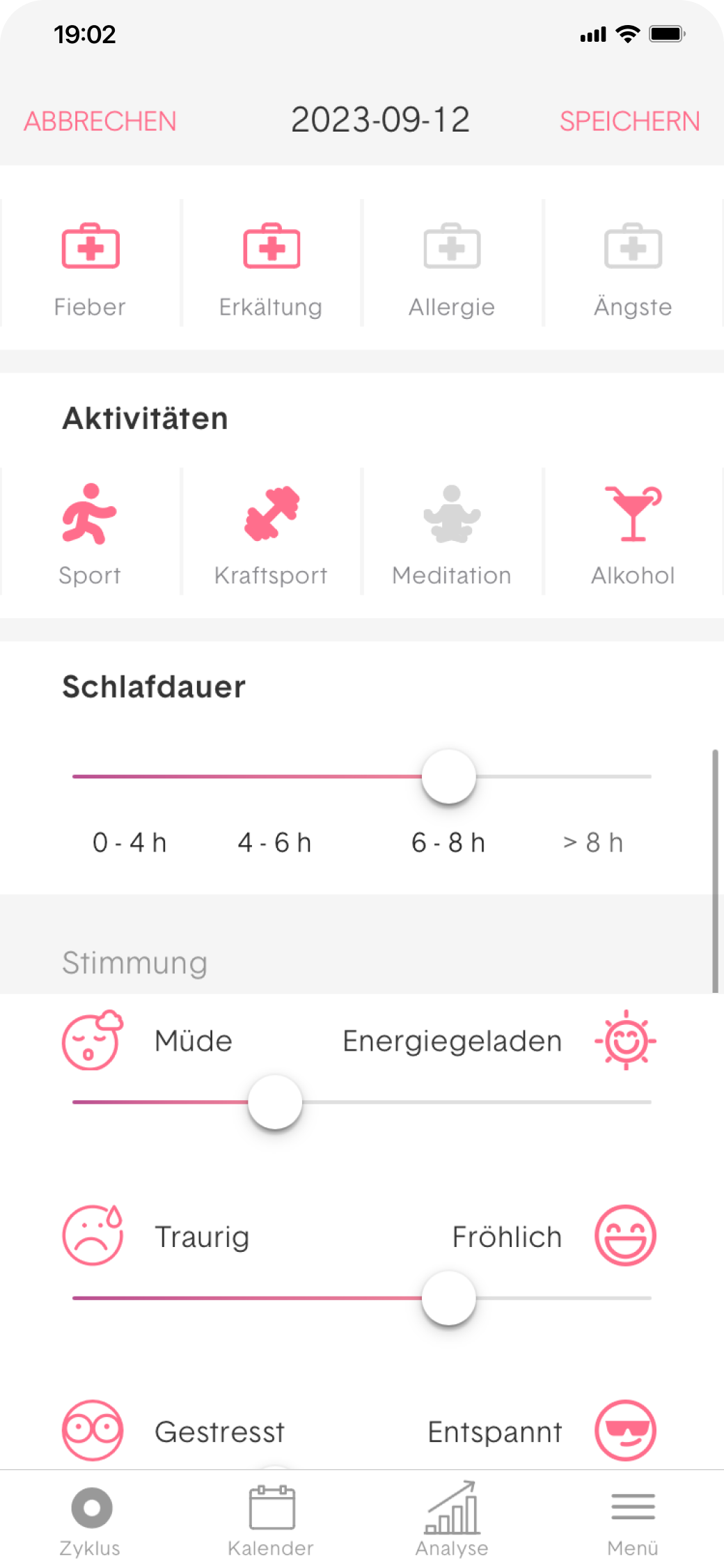
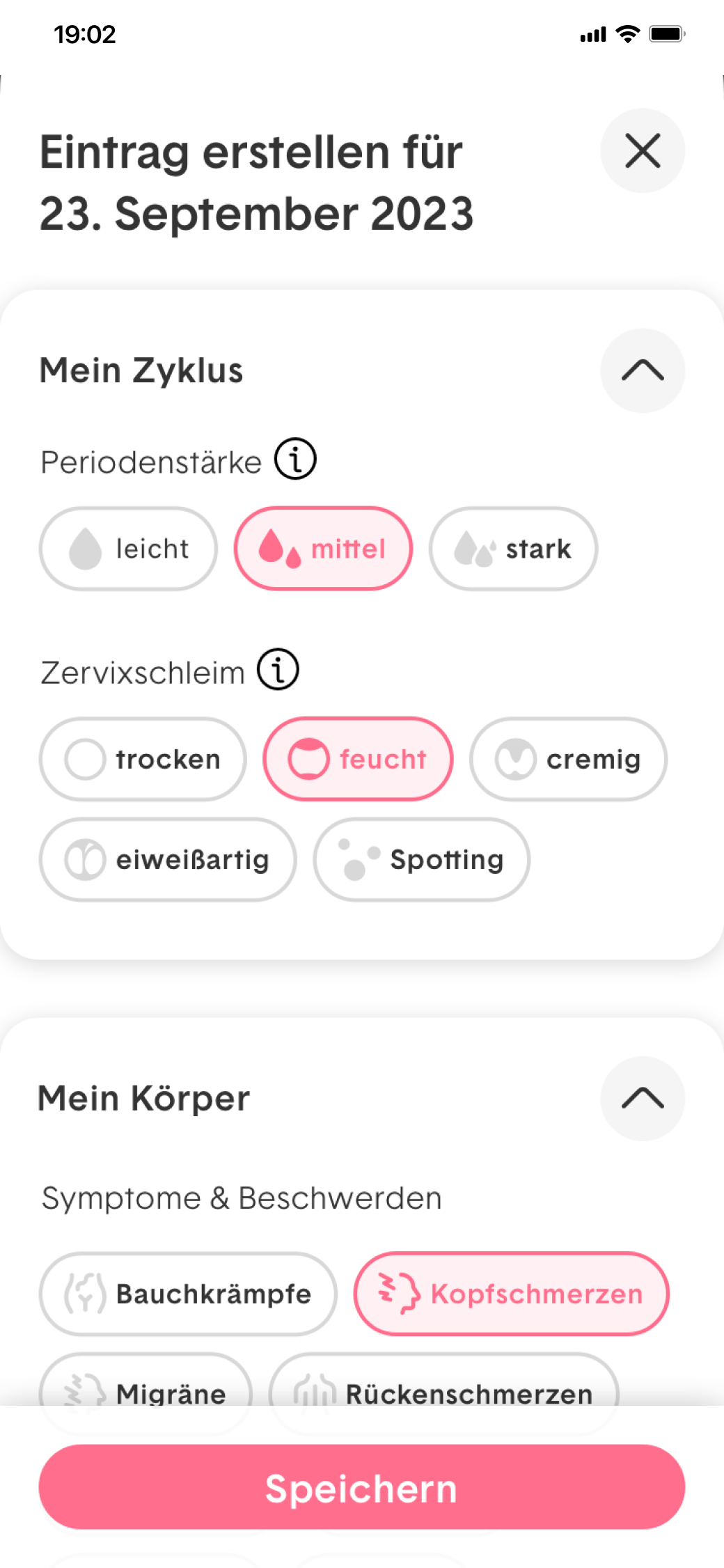
The new diary entry flow makes it easier to log feelings, symptoms, or notes – more guided, personal, and user-friendly.
Approach
We combined user research, strategy, and design iteration to improve both how the product looks and how it feels to use.
To start, we conducted a 3-month diary study to understand user behaviour and frustration points in everyday use. We followed up with a series of interviews to explore emotional expectations and tracked user needs more deeply through experience mapping workshops with the team.
We then simplified navigation, clarified key flows, and introduced light, guided interactions for daily tracking. Reporting was rethought to deliver insight in a tone that’s calm, non-clinical, and human. The visual identity was refined to feel trustworthy, warm, and aligned with the new femSense brand.
Finally, we supported UX testing and iteration – adjusting small but important interaction details, testing for edge cases, and making sure the product felt respectful at every step.

This audit shows the starting point: a heuristic evaluation that helped uncover friction points and guide improvements step by step.

Key insights from user interviews helped shape the redesign – highlighting what users value, what confuses them, and what they need most day to day.

The full experience map outlines the user journey from start to insight, highlighting important decisions and emotional points along the way.
Some questions that shaped the work

How can a cycle tracking app feel both medically accurate and emotionally supportive?
Users trust femSense for its medical-grade precision, but they also want to feel supported in their everyday life, not just monitored. The redesign focused on keeping the data clear while softening the experience through language, tone, and visual design.

What keeps users engaged with daily tracking and what causes them to stop?
We learned that consistency often depends on how easy and encouraging the process feels. Small barriers like confusing navigation or overly technical language can lead to drop-off. We simplified the flow and created a more welcoming tone to support daily use.

How do you present meaningful health insights without overwhelming users?
Users want to understand their patterns, but they don’t want to feel lost in charts or jargon. We refined the reporting to show just enough, in the right moment, with a calm and focused voice that feels informative, not clinical.

From cycle tracking to patch connection – these views show essential features restructured for clarity and flexibility.
Before & After
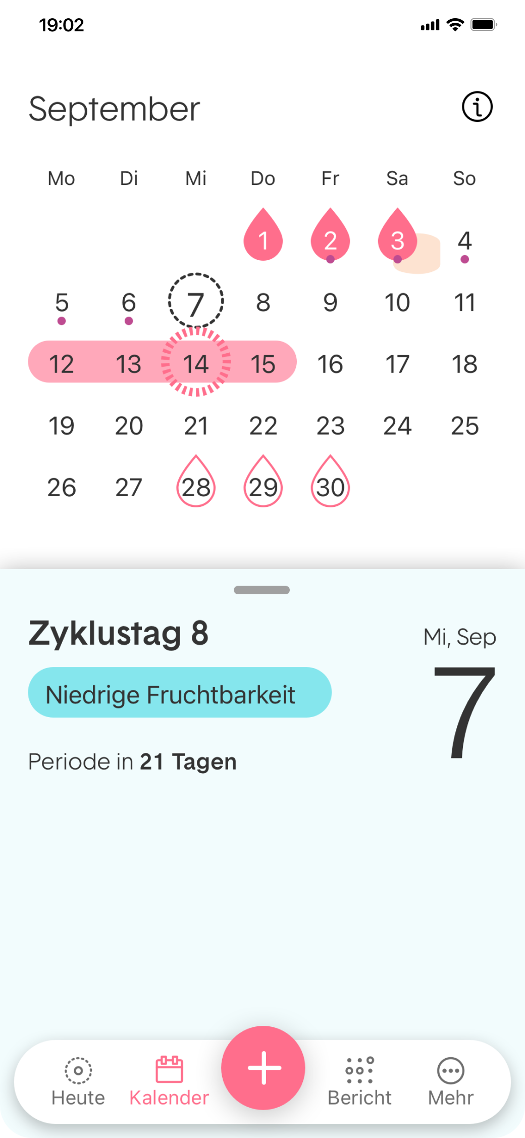
A side-by-side view of the redesigned calendar – more structured, easier to scan, and clearly aligned with cycle phases.
Result
The result is an app that feels calm, confident, and more in tune with daily life. Tracking now supports emotions as well as data. Navigation is clearer, flows are easier, and the overall tone feels more welcoming. The modular design also sets the stage for future product growth, while staying grounded in the femSense identity.
Before & After
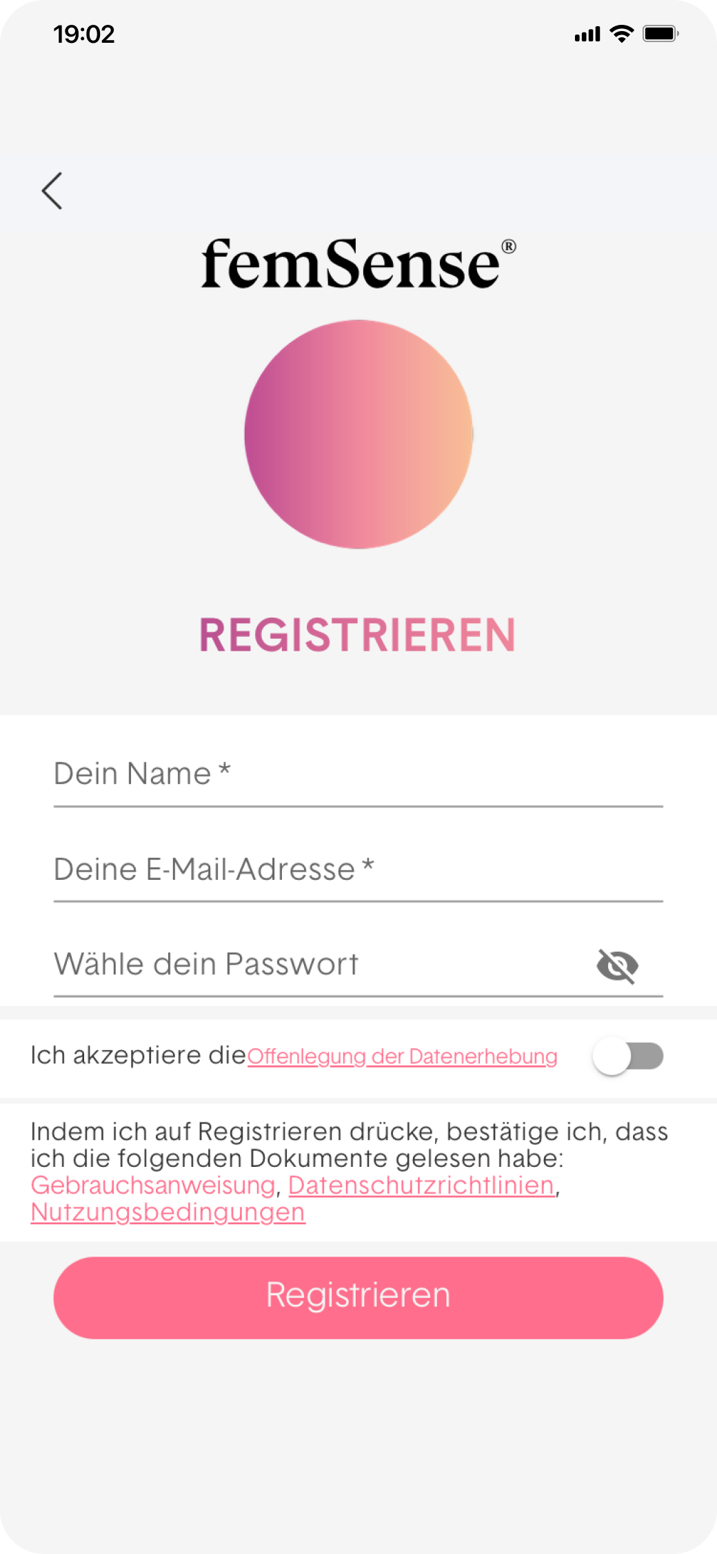
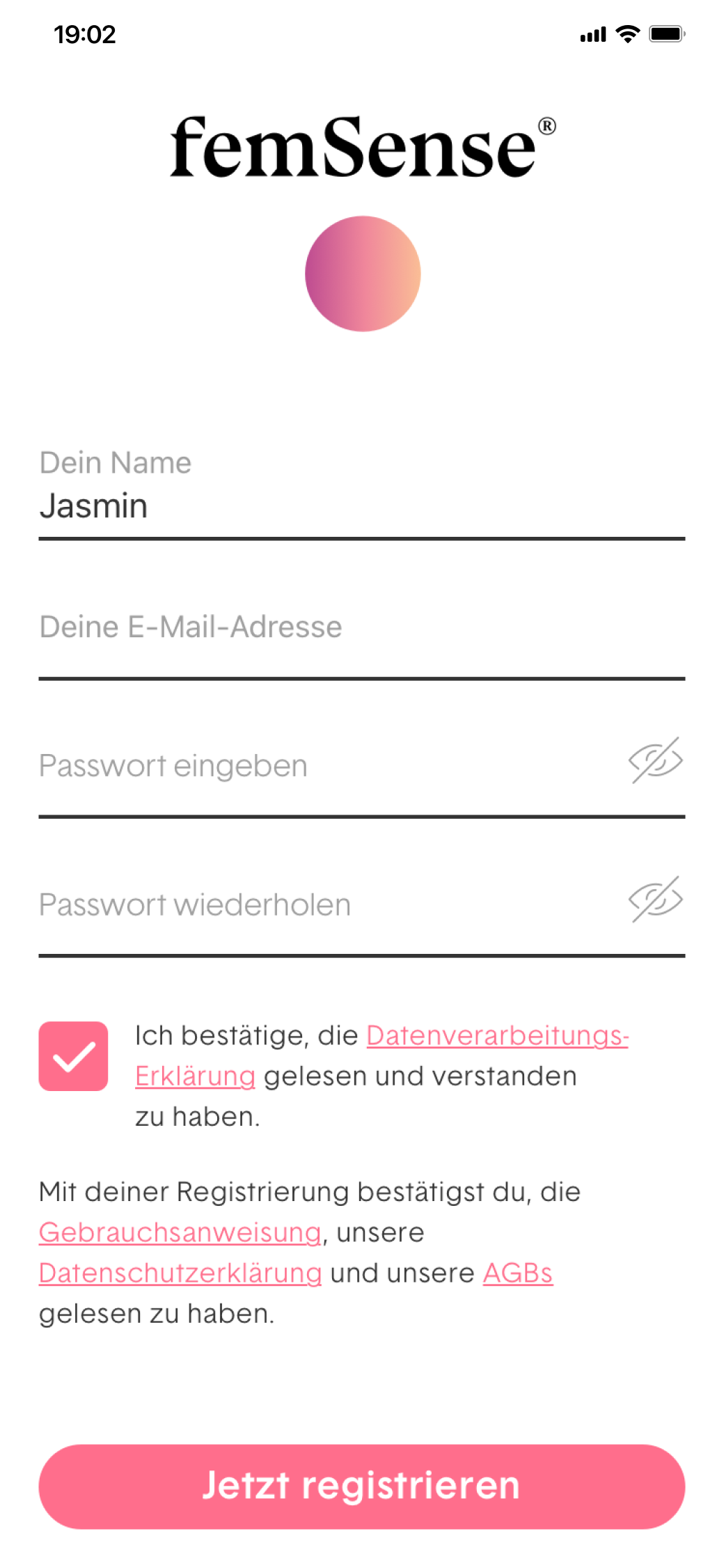
The updated registration process feels simpler and more trustworthy.

The new onboarding guides users gently through setup – focused, welcoming, and easy to follow.

The in-app tour explains key features and options in a friendly, lightweight way – helping users find their way from the start.
Before & After
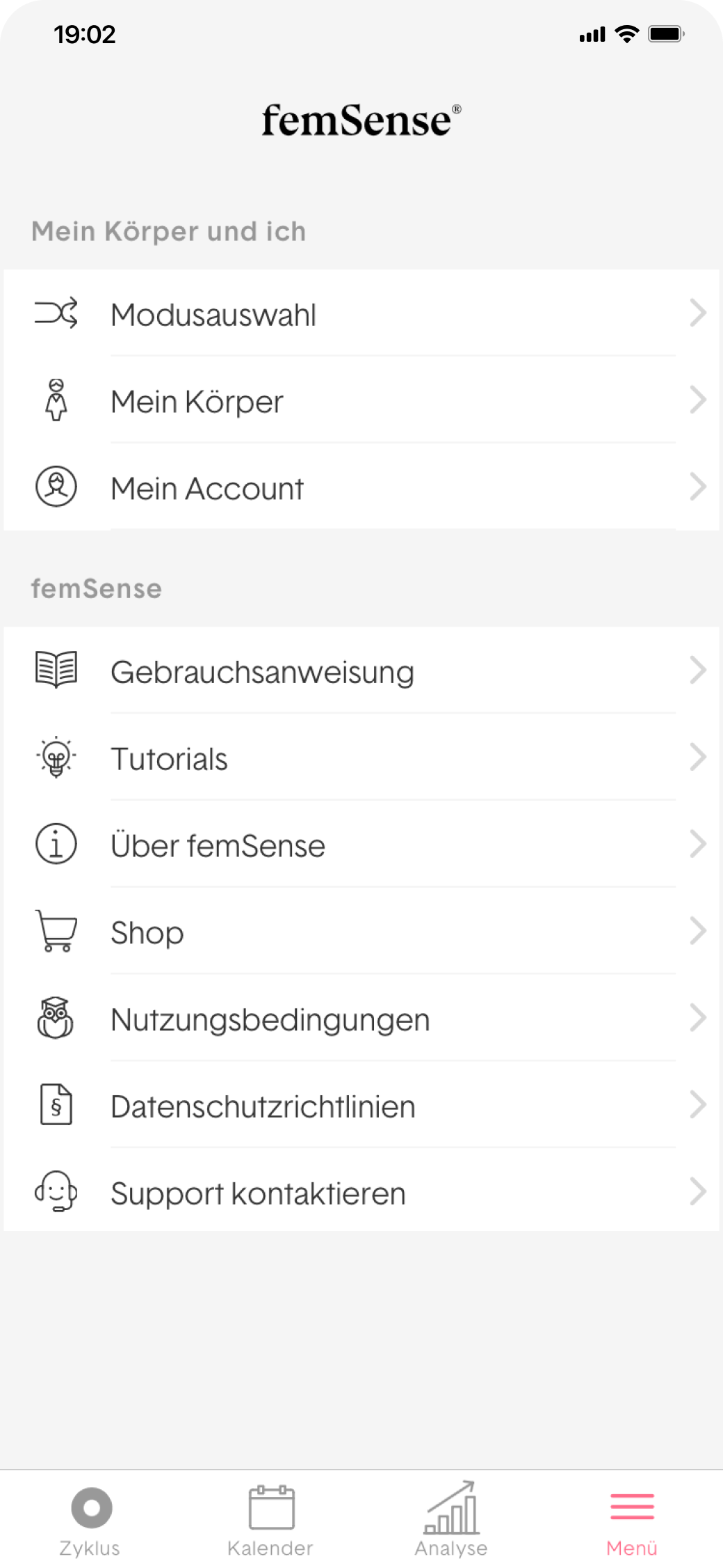
The new menu structure supports better orientation, making it easier to find relevant features and move through the app.

These screens show how the app supports users as a daily guide – from switching between tracking modes to exploring FAQs, understanding symbols, and adjusting personal settings.
What I contributed
UX and UI strategy across the rebranding process
Planning and conducting user research
Flow definition and interface design for key screens
Design support during prototyping, testing, and rollout
Worth a mention
This project showed me that cycle tracking isn’t just a task – it’s a ritual. When design meets real-life rhythm with care and clarity, it becomes something people trust and return to. Listening to users shaped every part of this process.
Working on something people use every day?
Let’s create a user experience that makes sense from the start – simple, human, and built for everyday moments.
Let’s make something meaningful.
Emanuel Jochum, Experience Design
Rotenturmstraße 27/2, 1010 Vienna, Austria
+43 699 17191982, hello@ejochum.com
© Emanuel Jochum, 2025
Simple is beautiful