Website for GED Wohnbau
Creating a digital home that’s easy to navigate
For sustainable real estate developer GED Wohnbau, I designed a lightweight and flexible website that’s easy to update and easy to use.

Facts
Client
GED Wohnbau GmbH
Team
Gerald Lauffer (account & project management, concept, text)
Fabian Pimminger (development, technical support)
Emanuel Jochum
My role
UX design, UI design
Duration
2023–2024
Sector
Real estate, housing development
Website
ged-wohnbau.at
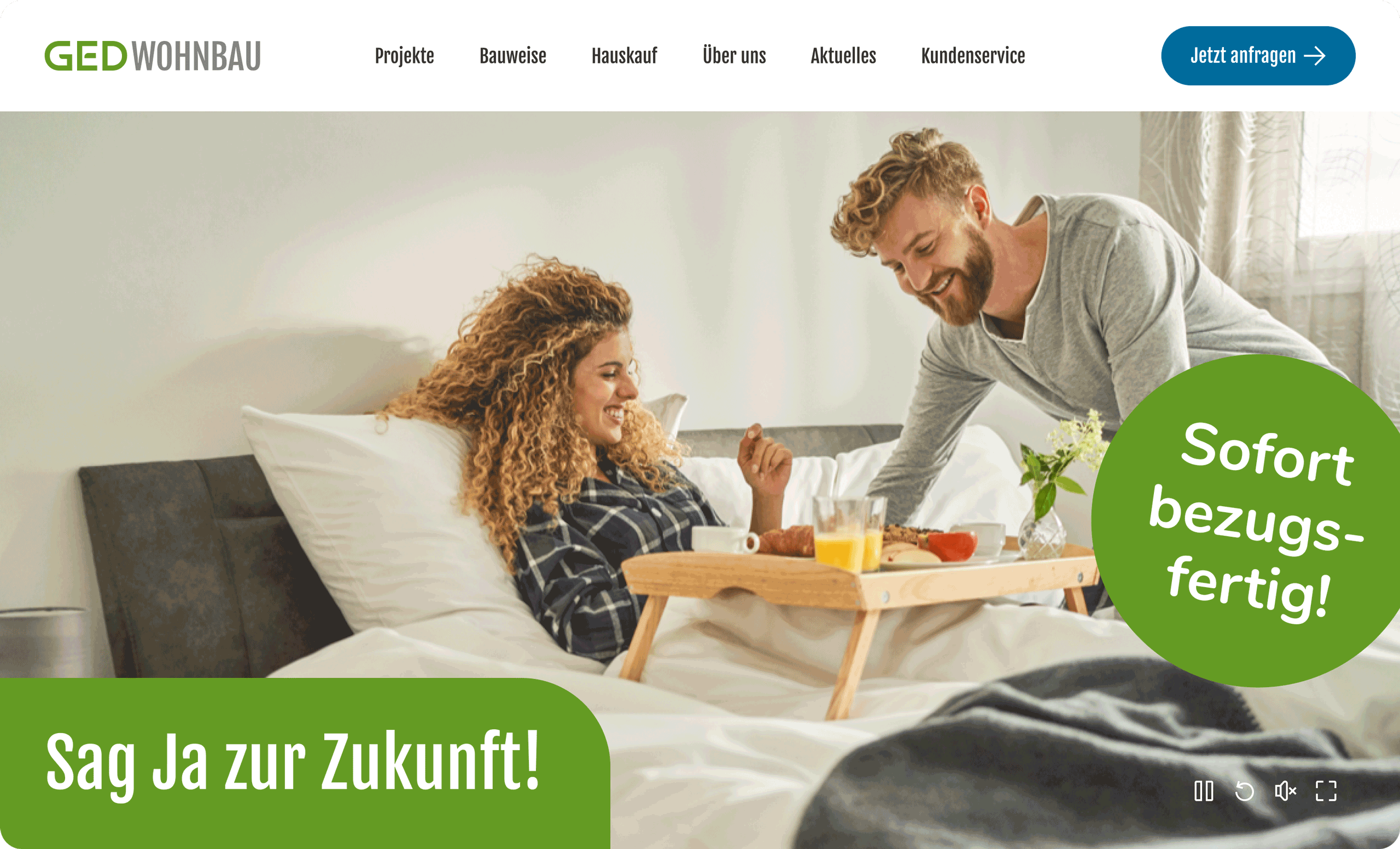
The hero section welcomes visitors with a strong visual, a clear headline, and a promotional bubble that sets the tone right from the start.
Challenge
GED Wohnbau develops affordable, quality housing in Lower and Upper Austria with a down-to-earth approach. However, their old website felt outdated and inflexible. It didn’t reflect who they are or how they talk about their work – and it made it difficult to present new projects in a clear and welcoming way.
The new site needed to be compact, approachable, and easy to navigate, while remaining flexible enough to grow and adapt over time.
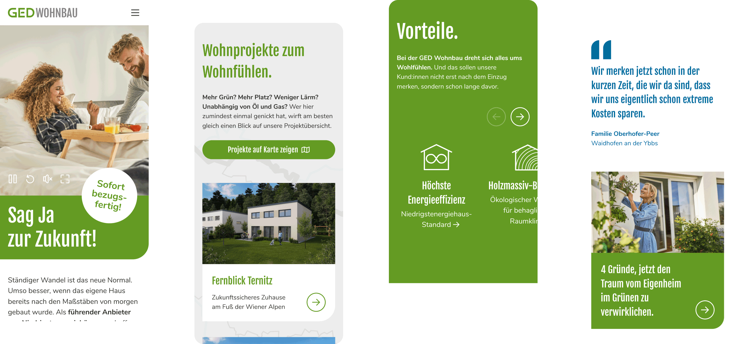
A calm, mobile-first start that helps users find their way quickly – clear, welcoming, and easy to scroll.
Approach
We focused on creating a lightweight, modular system that presents projects clearly and works beautifully across screen sizes. The visual tone is friendly, open, and confident – just like GED.
The navigation is simple and direct, with page layouts that repeat across sections to keep content easy to manage. To support flow and help users move intuitively through the site, we integrated soft micro-animations – hover states, image fades, and gentle transitions – that guide attention without ever feeling flashy.
The site is mobile-first, accessible, and designed to scale as GED adds new projects or features over time.
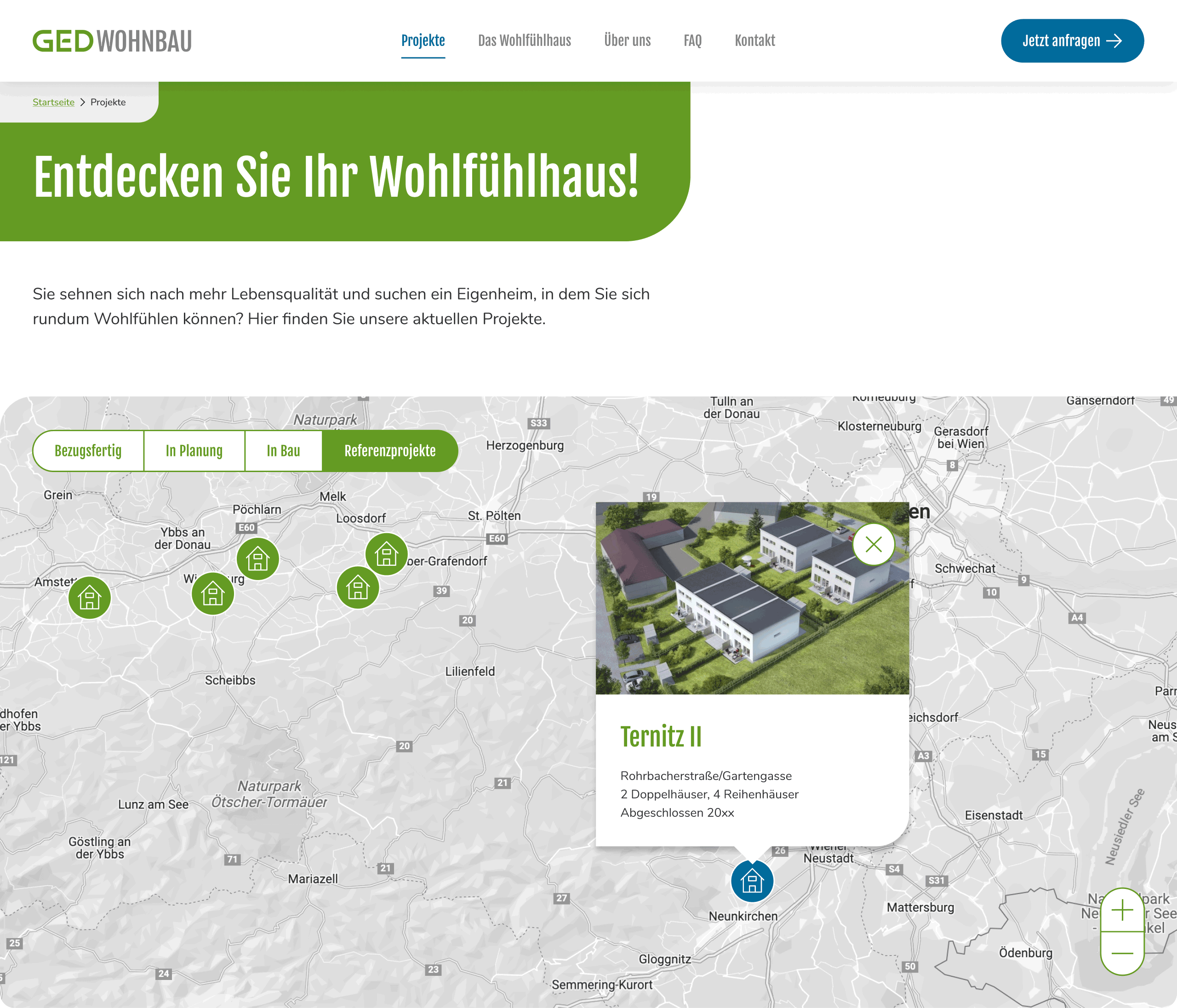
A simple map view to explore nearby projects – supporting quick orientation and context.
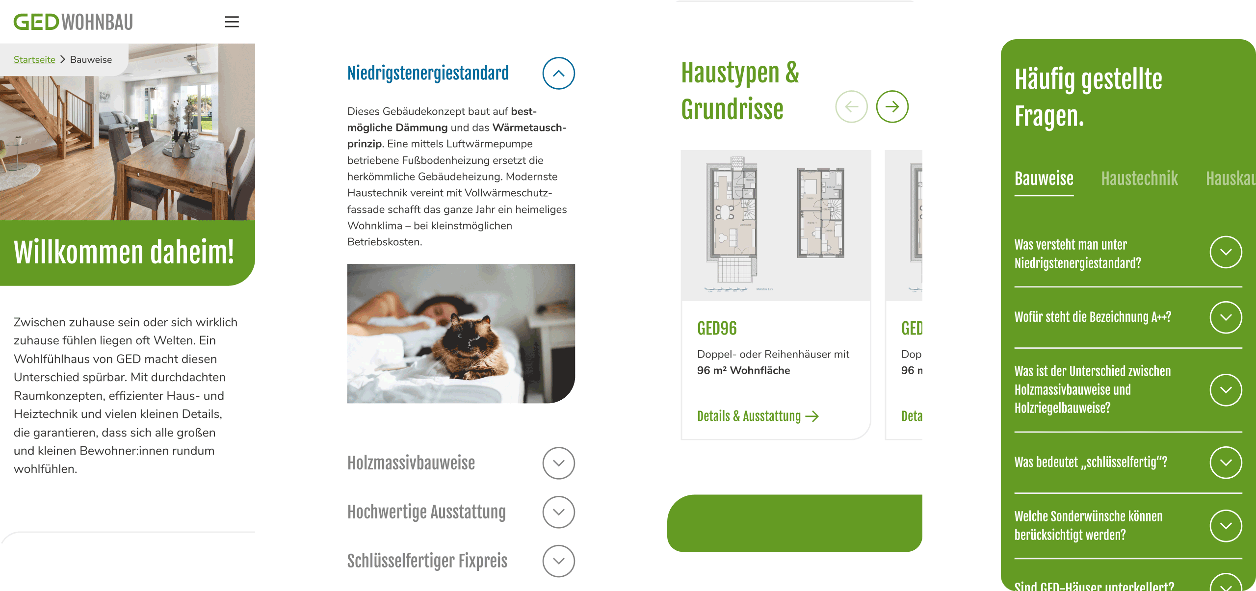
Well-structured content blocks with clear headlines make the information easy to digest.
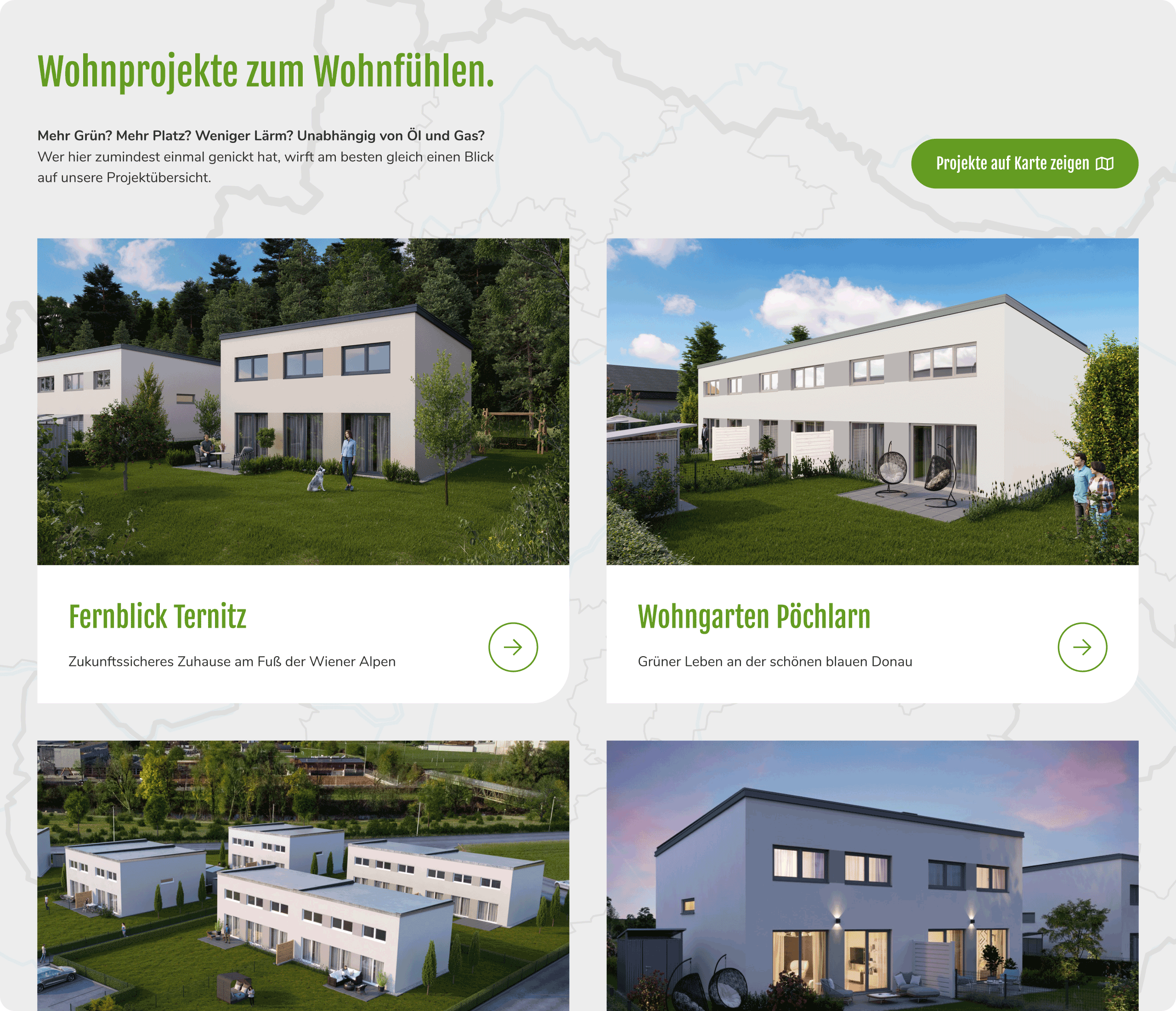
A project overview that’s compact but complete – helping users compare at a glance.
Some questions that shaped the work

How do we help someone looking for a new house understand what’s currently available – without creating a full real estate portal?
We created a project overview page with short, image-rich cards that show key info (location, units, construction status) at a glance. No logins, filters, or accounts needed.

How do we build trust if someone’s never heard of GED Wohnbau before?
We used consistent design, real project photos (not renderings only), and a calm page structure – plus a simple “About us” section showing experience and the type of housing GED builds.

What should the site say to city or communal officials who might visit as potential collaboration partners?
We added a short company introduction that explains GED’s experience, values, and typical project scale – including images that show integration with rural environments and neighbourhoods.
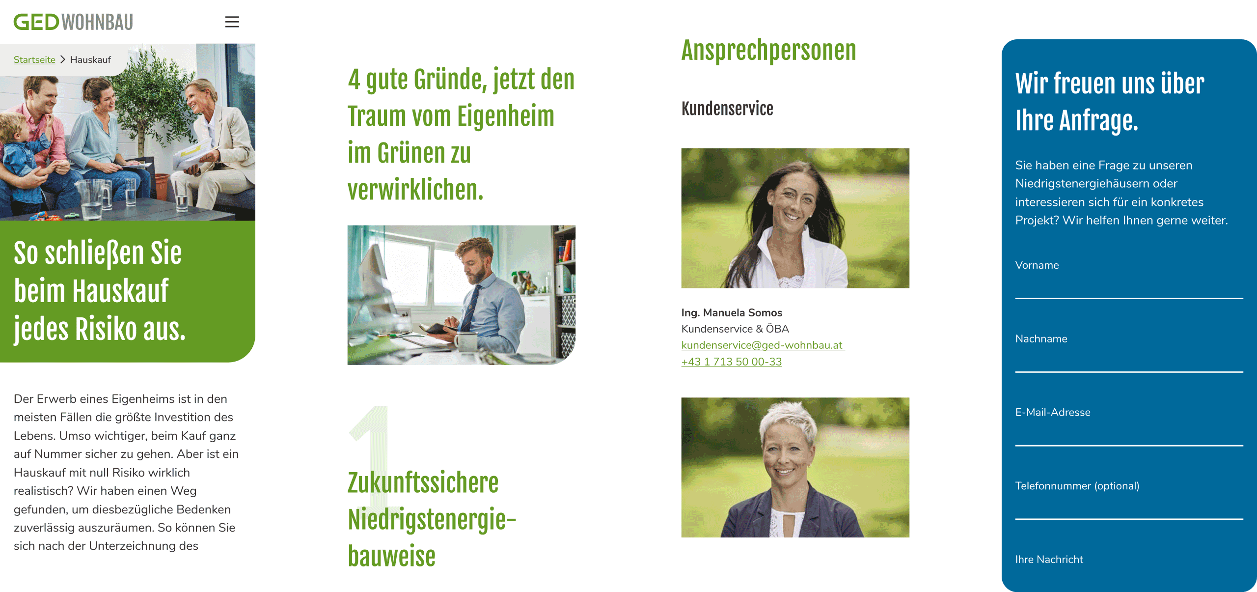
Human visuals and short forms create trust, making it easier to reach out or learn more.
Result
The result is a clean, responsive website that’s easy to navigate, light to maintain, and ready for the future. Visitors can browse housing projects quickly and get key details at a glance.
Soft transitions and micro-interactions create a sense of care without pulling focus. The design system is calm and neutral, allowing the content to shine. And the GED team can confidently update the site on their own – keeping it fresh and relevant without extra work.
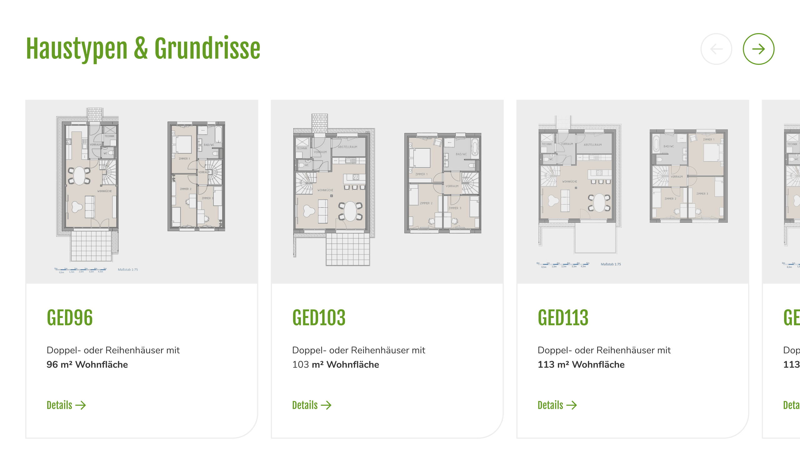
Slideable house type cards make browsing intuitive which is ideal for mobile decision-making.
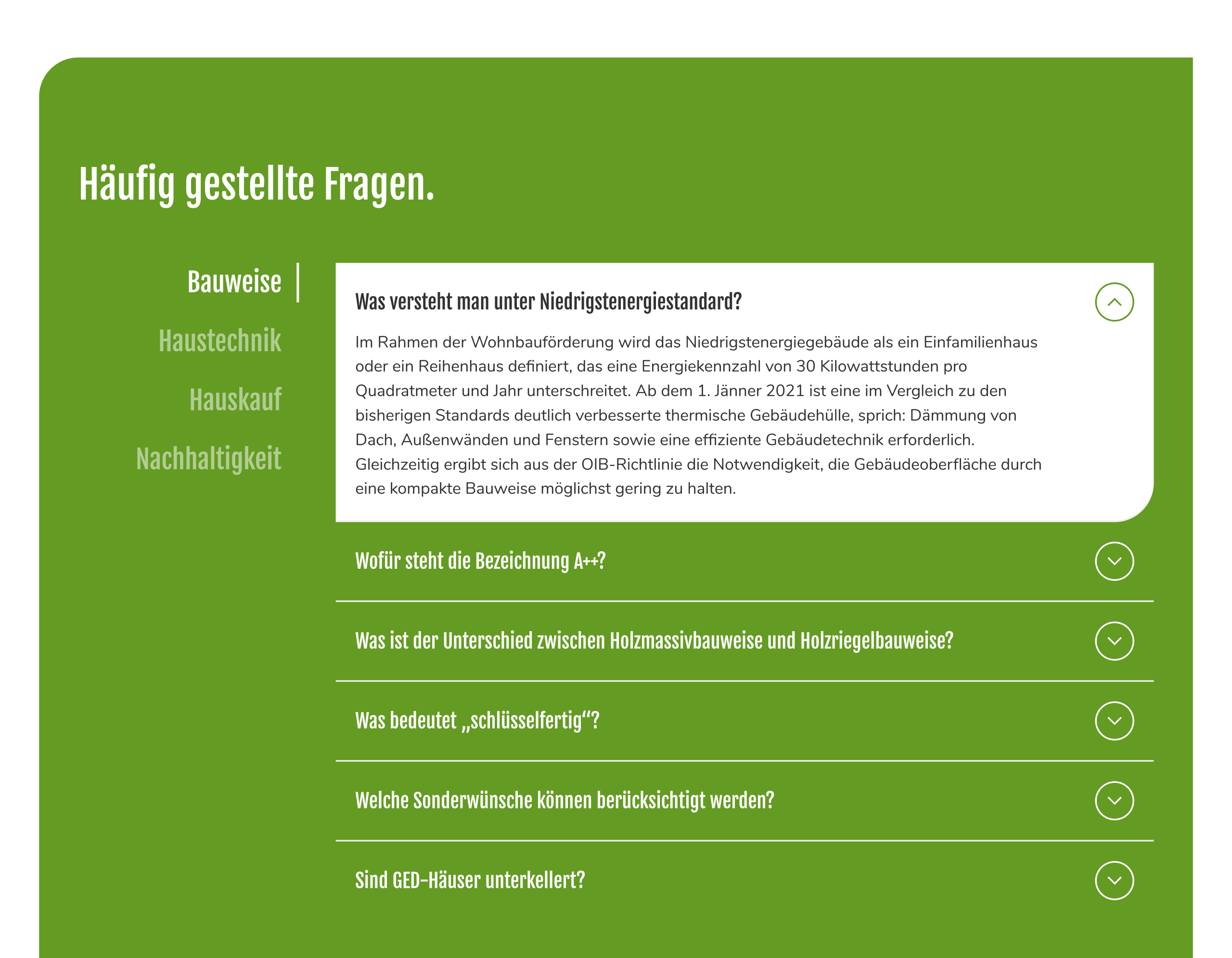
Expandable FAQs keep things tidy while still answering what people really want to know.
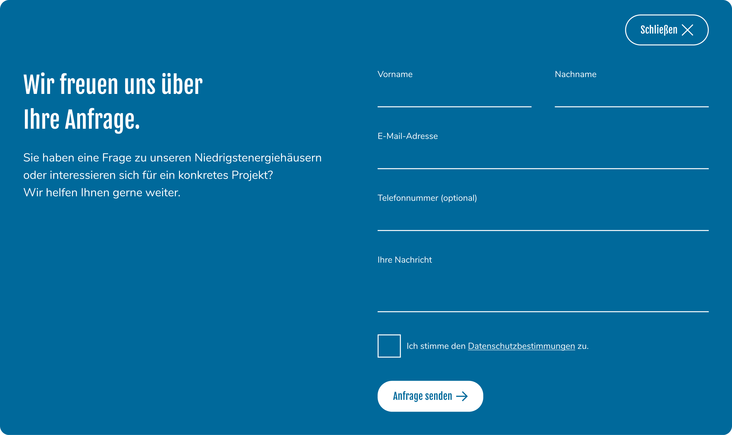
A lightweight contact form always in reach – making it easy and fast to get in touch.
What I contributed
UX & interaction design
UI design
Support during implementation and refinement
Worth a mention
This project was a great reminder that simplicity is a strength. The combination of clarity, calm layout, and micro-details created a website that feels approachable and high-quality – even with just a handful of pages. It’s a small site that leaves a clear impression.
Running a business with heart and need a website to match?
Whether you build homes, offer services, or run a local company:
I help turn what you do into a clear, trustworthy online presence that feels like you.
Let’s make something meaningful.
Emanuel Jochum, Experience Design
Rotenturmstraße 27/2, 1010 Vienna, Austria
+43 699 17191982, hello@ejochum.com
© Emanuel Jochum, 2025
Simple is beautiful